JEVA: Building a Brand That’s Bigger Than the Cart
The Background
JEVA started as a school project. Today, it’s a growing local favorite.
We helped them turn their pop-up charm into a brand that’s ready for more.
The Challenge
The challenge was to create an identity system that could level up JEVA, keeping them cohesive across every touchpoint while giving the brand clear direction. At its heart, it was about capturing their passion and potential, and building a foundation to support their journey as they grow.
Scope of the Project
Brand Strategy Logo & Identity Systems
The Spark
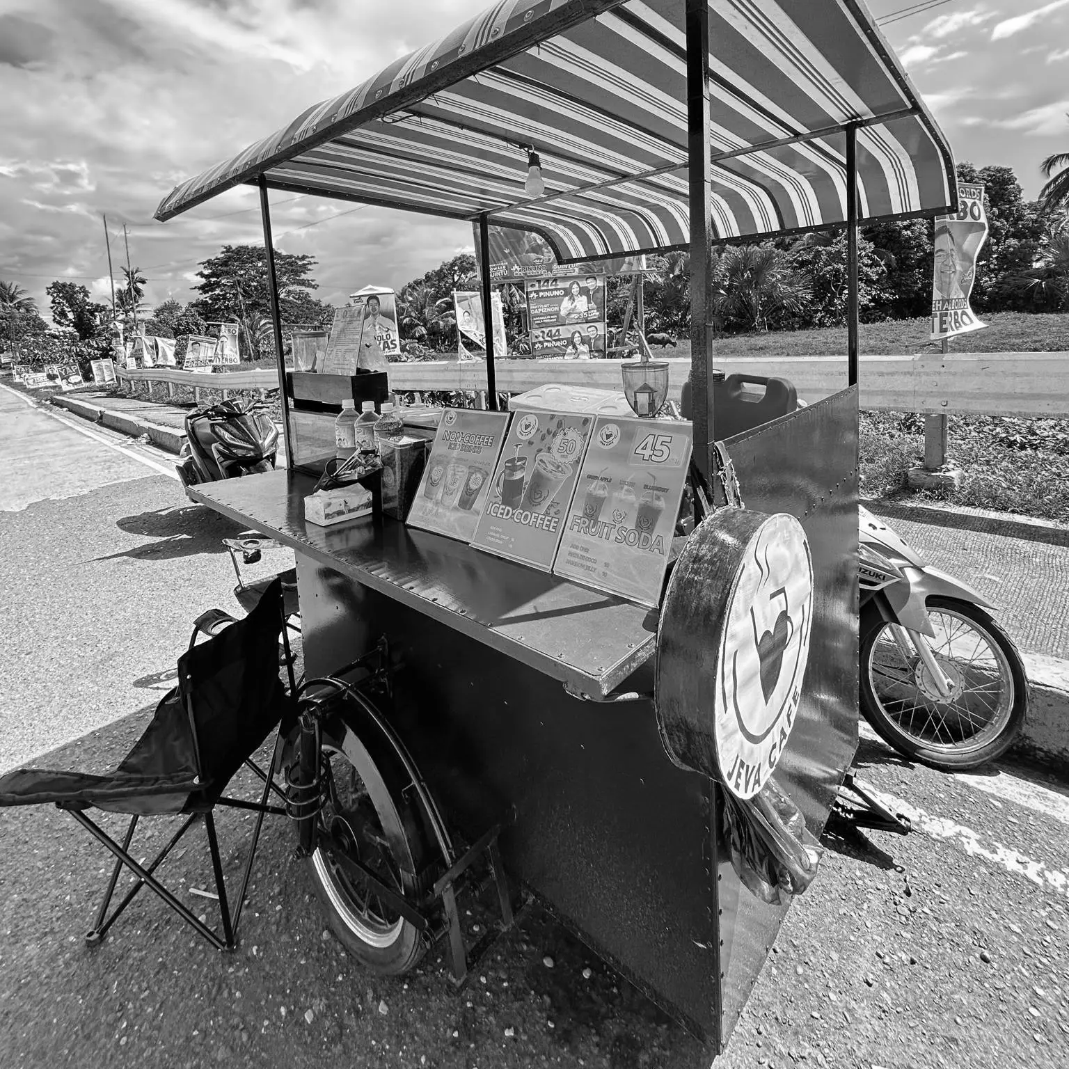
This may look like a cart now, but you’re building something with so much more to give.
JEVA began with two young founders, Jessiery and Valerie, who poured their hearts into a college project that became something more. What started as a cart kept going — not because they had to, but because they believed in what they were building. But belief alone isn’t always enough to stand out. In a city full of coffee carts, they needed a brand that captured their passion and potential.
The Turning Point
At the time, JEVA had no clear visual identity — just a rotating set of logos, Canva templates, and trial-and-error branding. Like many small businesses, they thought they had to wait until they were “big enough” to invest in design.
We reminded them: if you’re serious about your dream, it’s never too early to build a brand with direction.
Our Approach
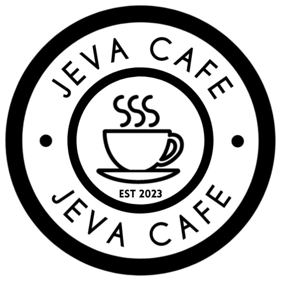
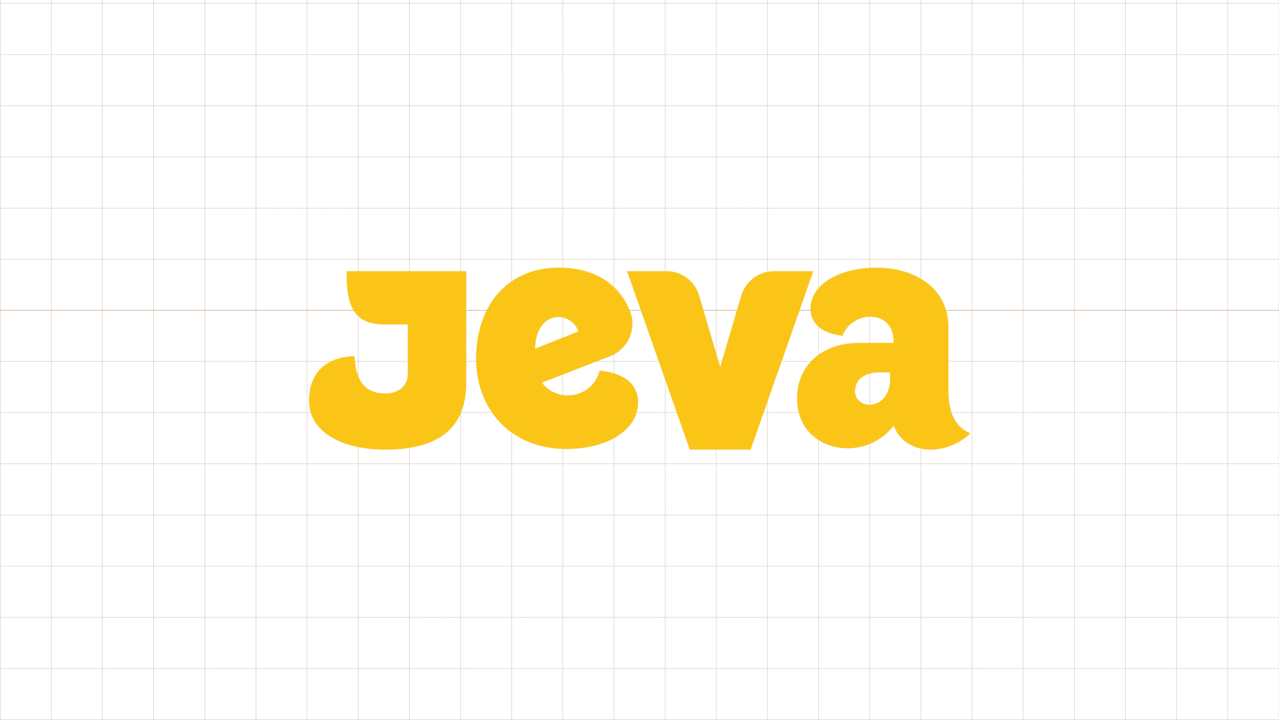
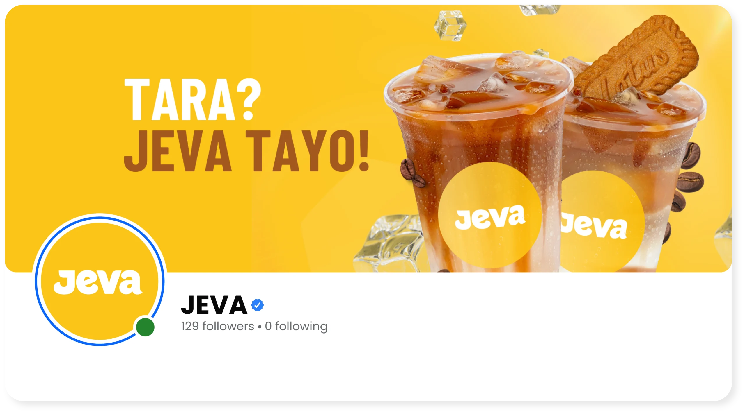
We began with the wordmark—deliberately clean, bold, and icon-free. This minimalist approach ensures instant recognition while keeping the focus on the name “JEVA” itself. We avoided distracting symbols to let the typography speak clearly and confidently.
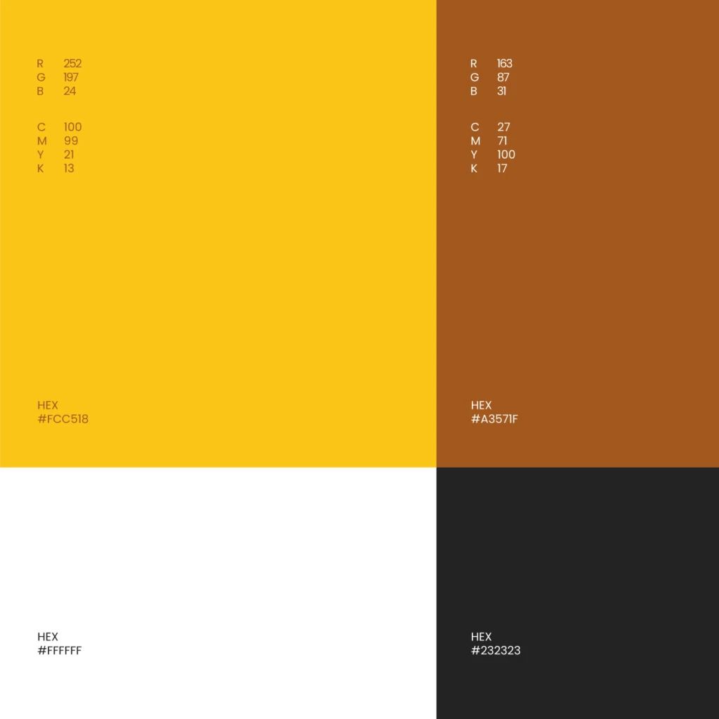
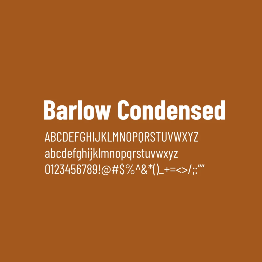
Next, color. We led with yellow — happy, energetic, and appetite boosting. Typography? We went with Barlow Condensed. It is modern, easy to read, and perfect for everything from menu boards to social posts. It has just the right amount of edge without trying too hard.
We kept asking ourselves the same question throughout the process.
Does this feel like JEVA? Does it sound like them? Would Jes and Val smile when they see this?
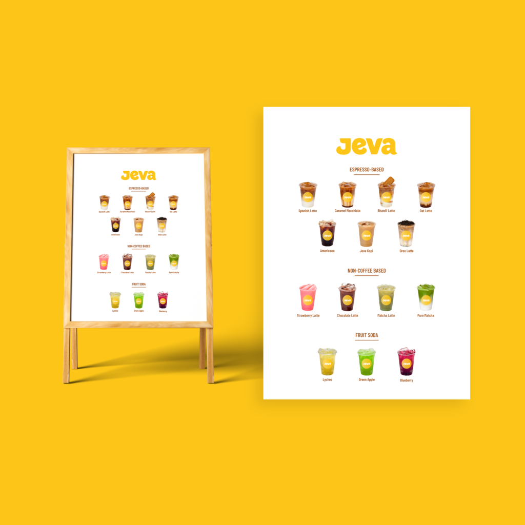
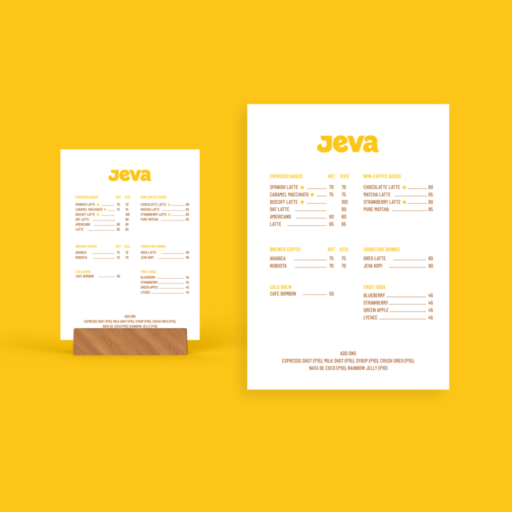
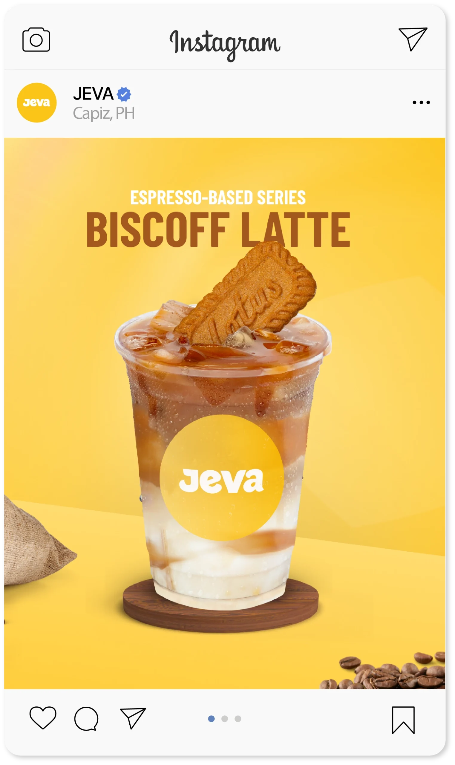
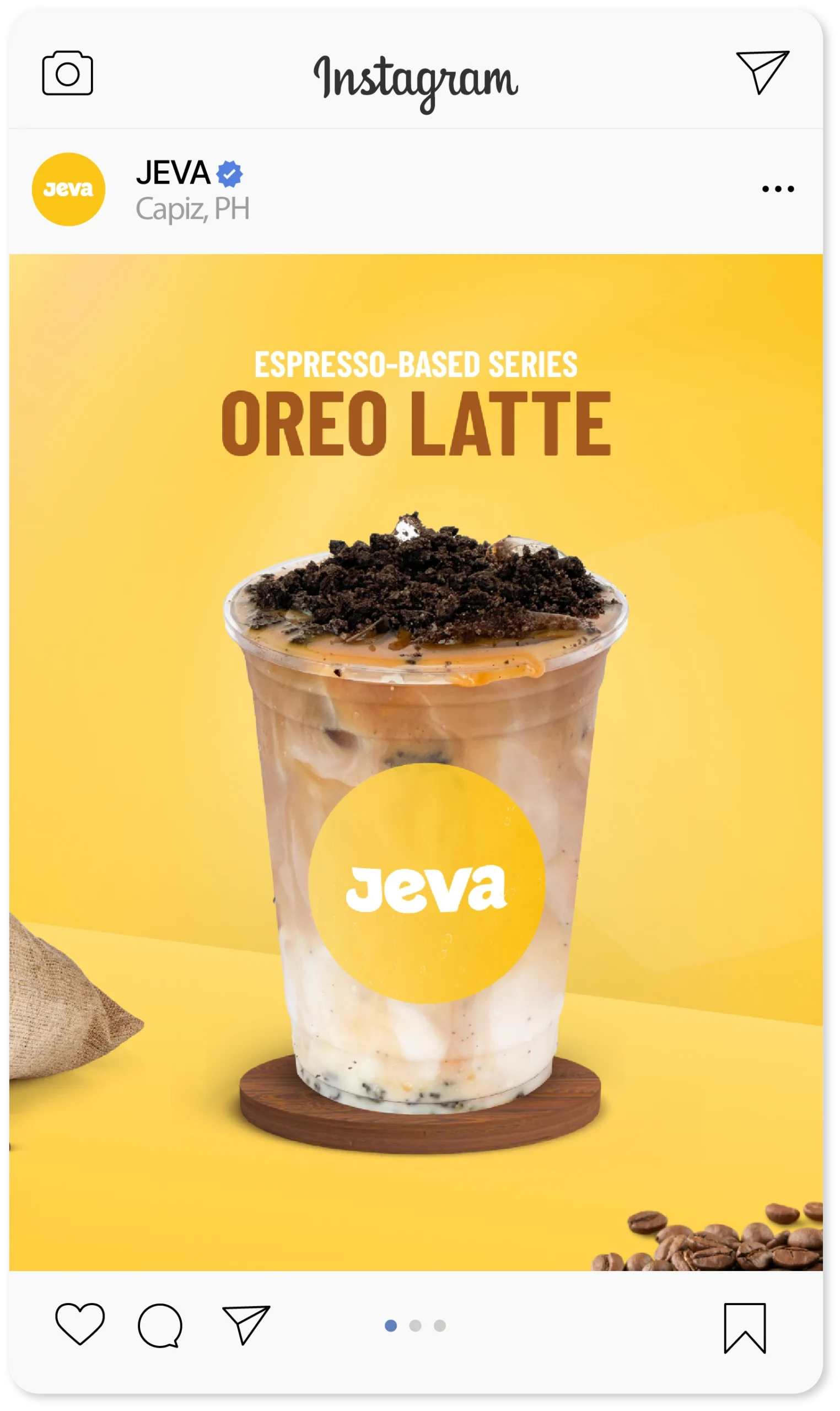
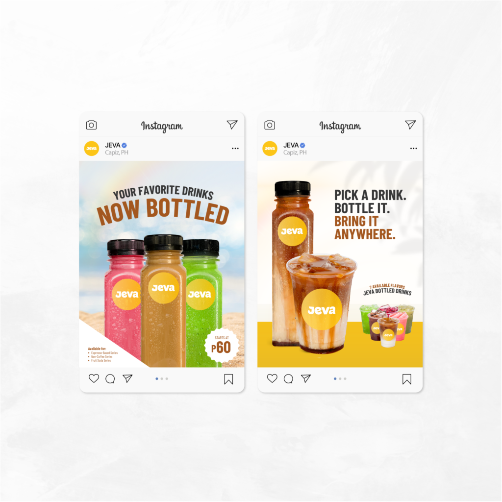
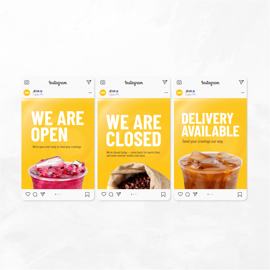
A Brand That Shows Up — Online and On the Street
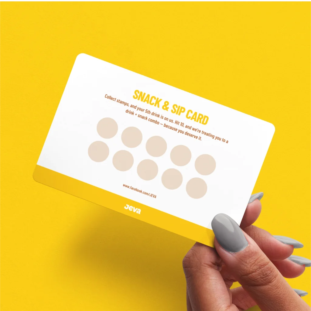
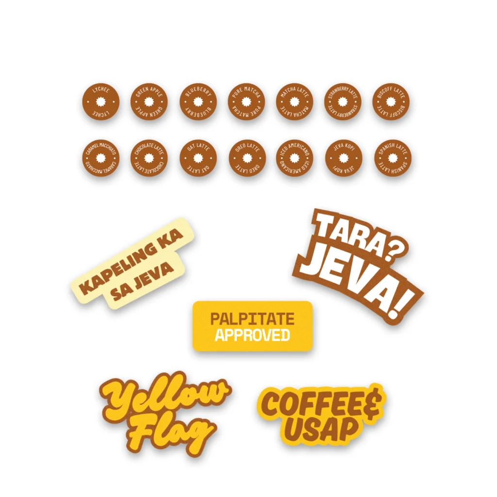
We helped them apply the brand across every touchpoint:
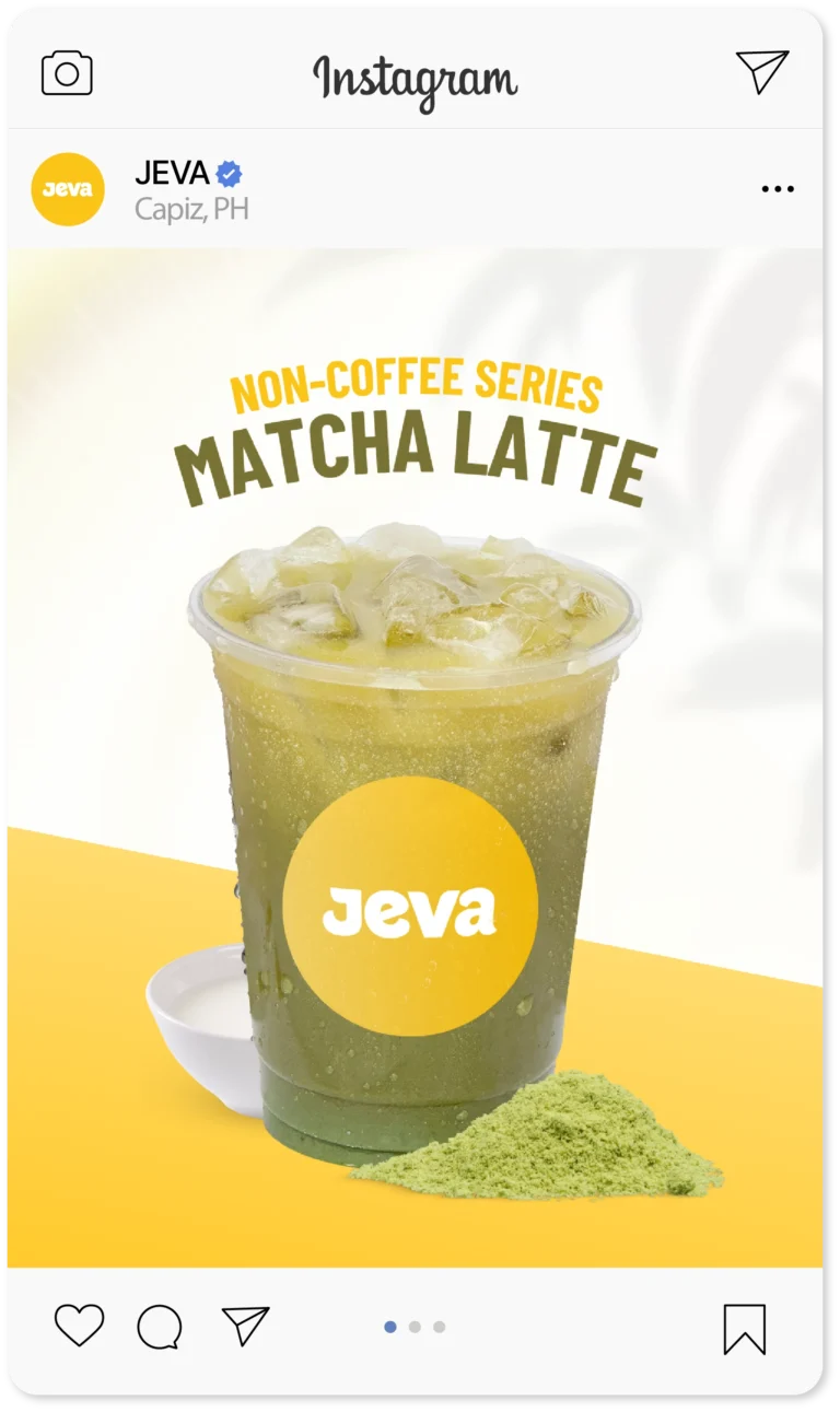
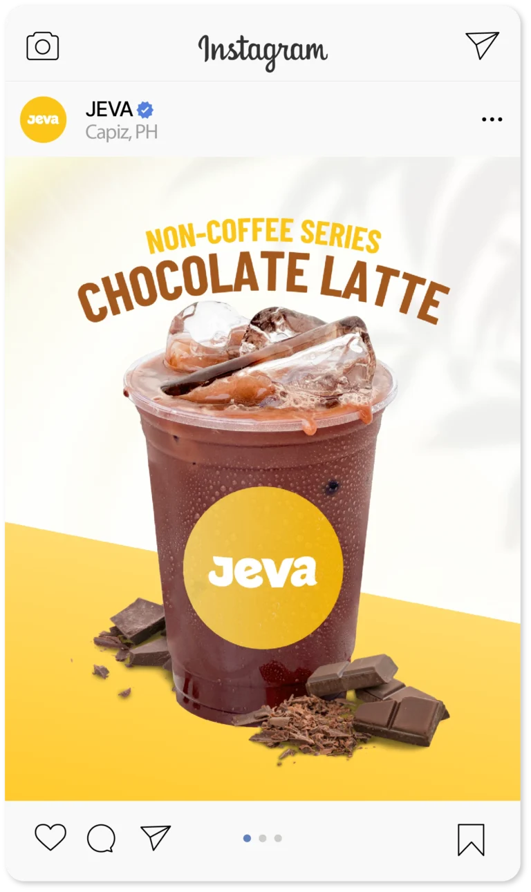
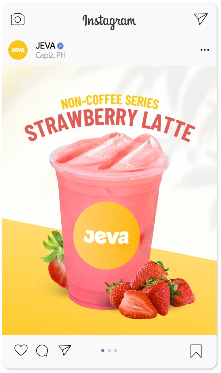
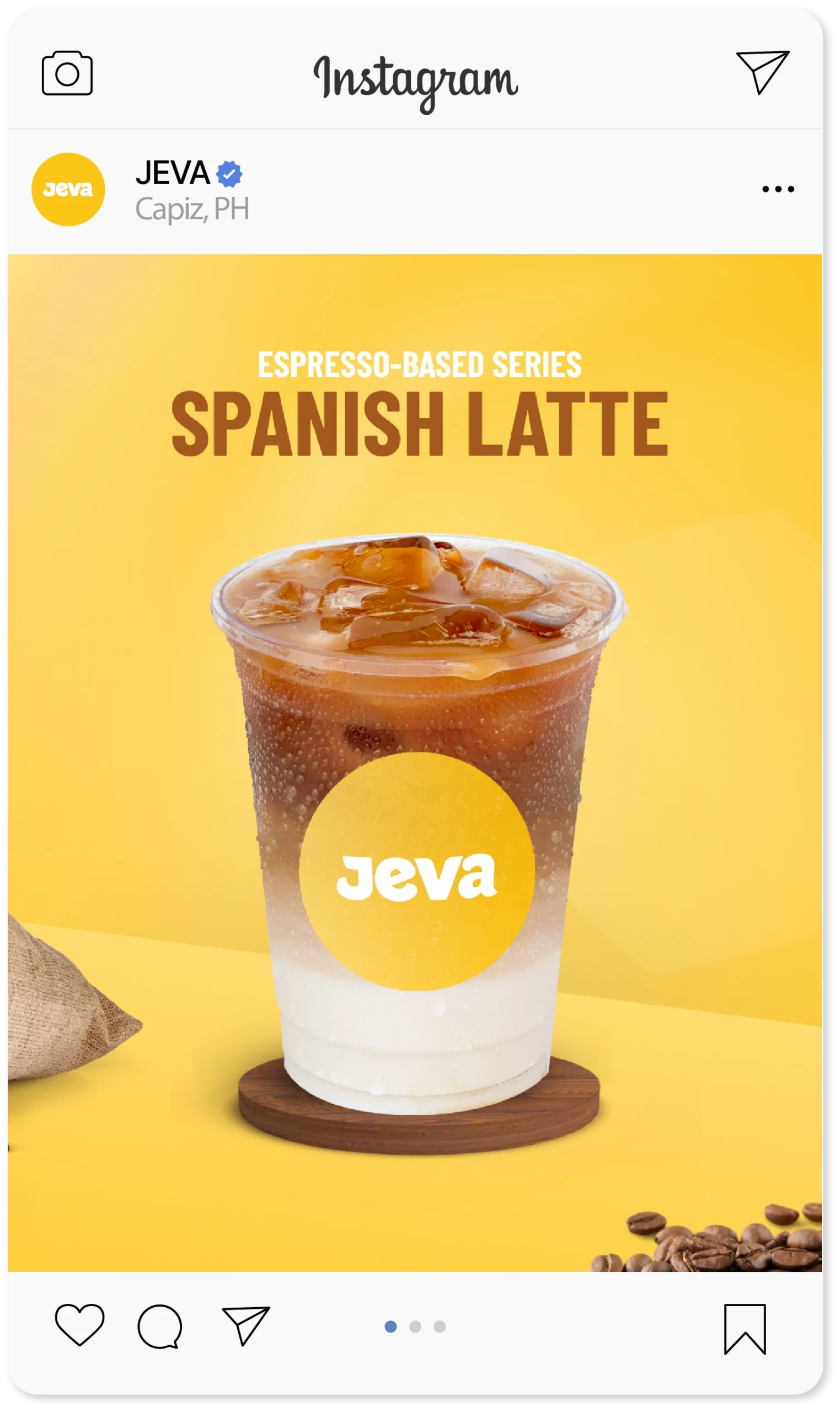
From loyalty cards to posters, menu boards to Instagram drink series — every piece felt consistent and true to their story. We also cleaned up their Facebook presence with new headers and a refreshed tone of voice.
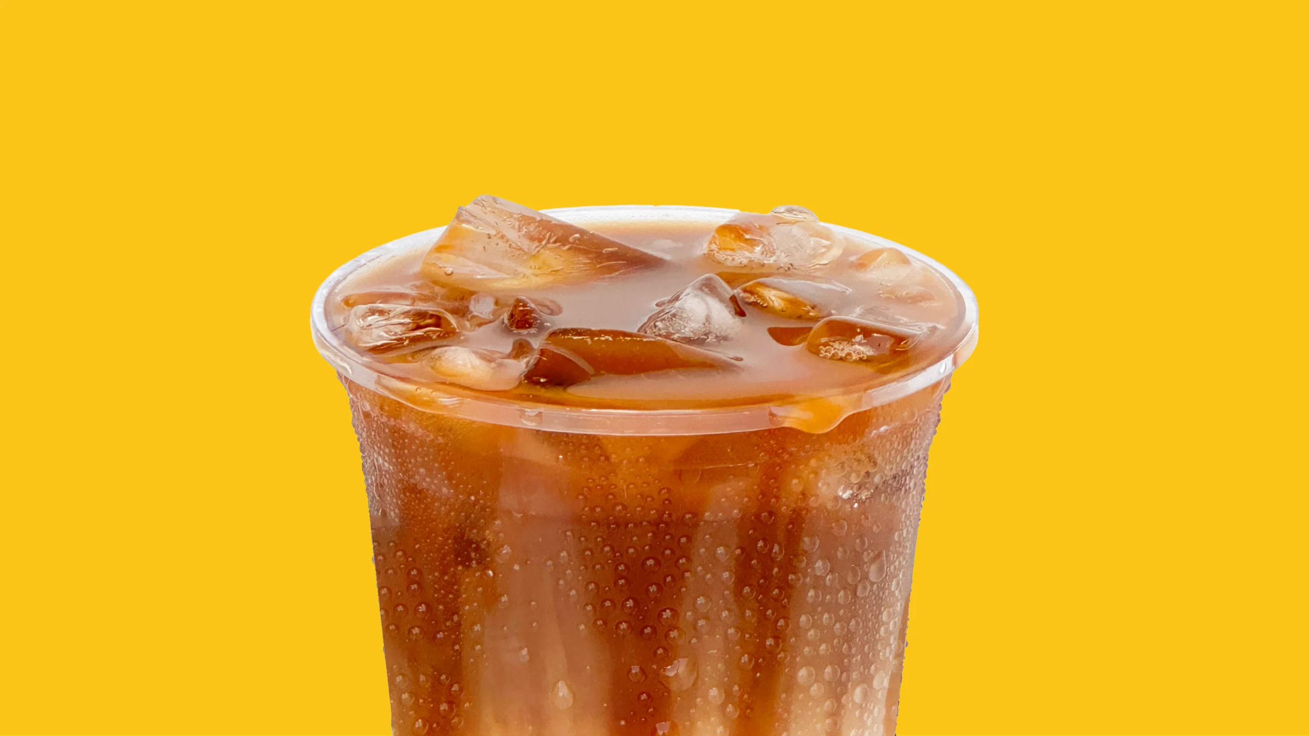
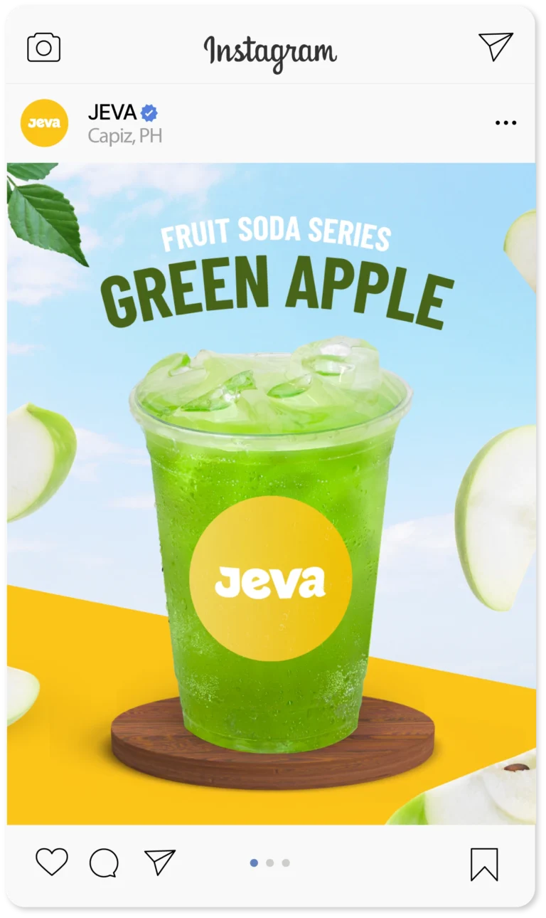
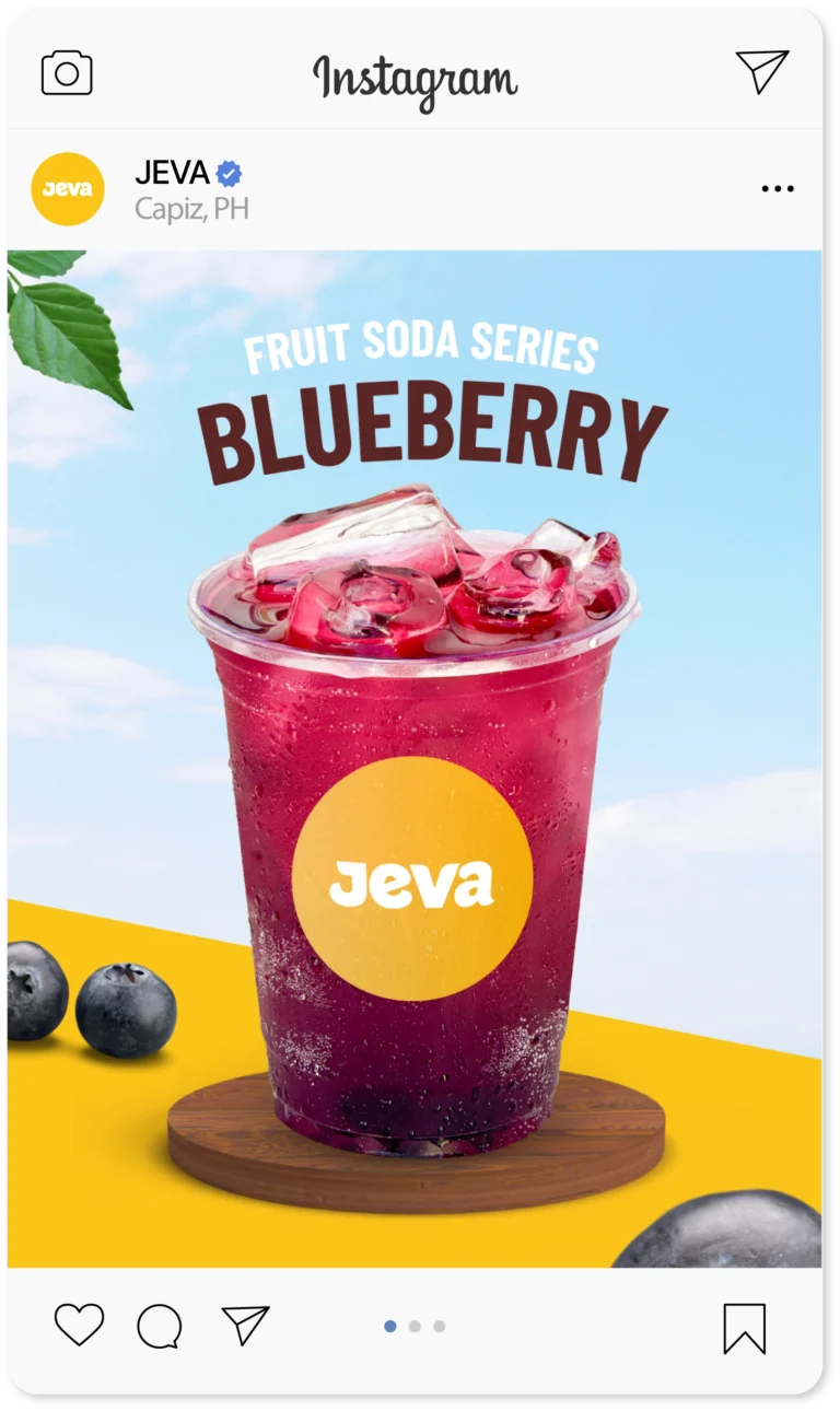
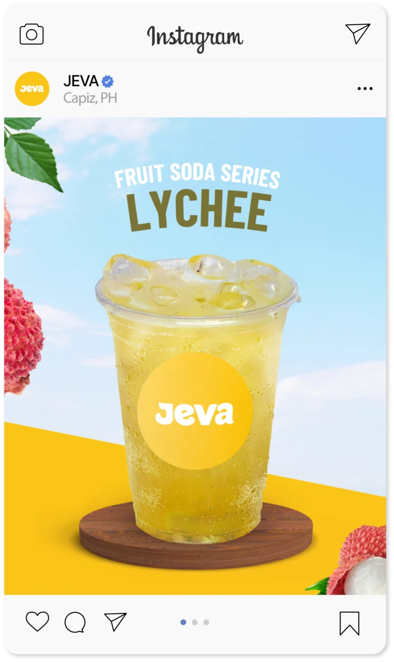
Fruit Soda Series
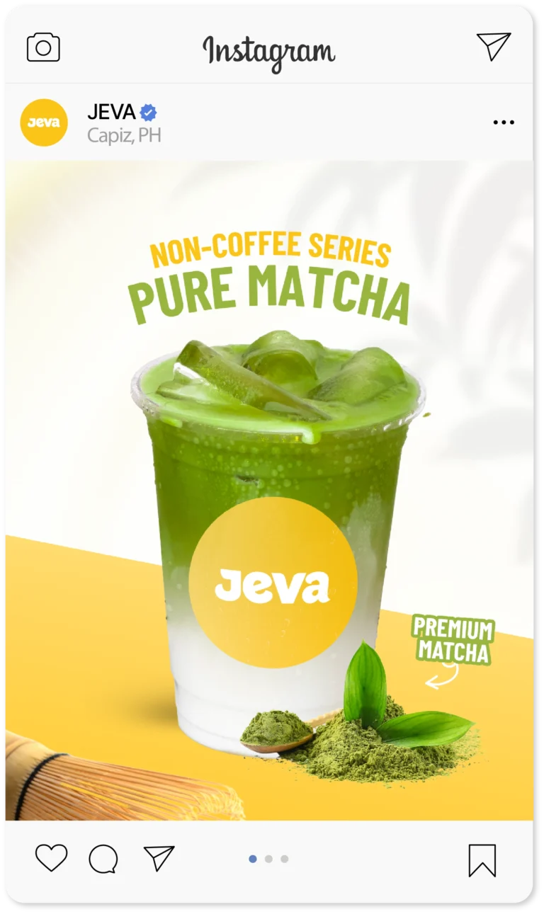
Non-Coffee Series
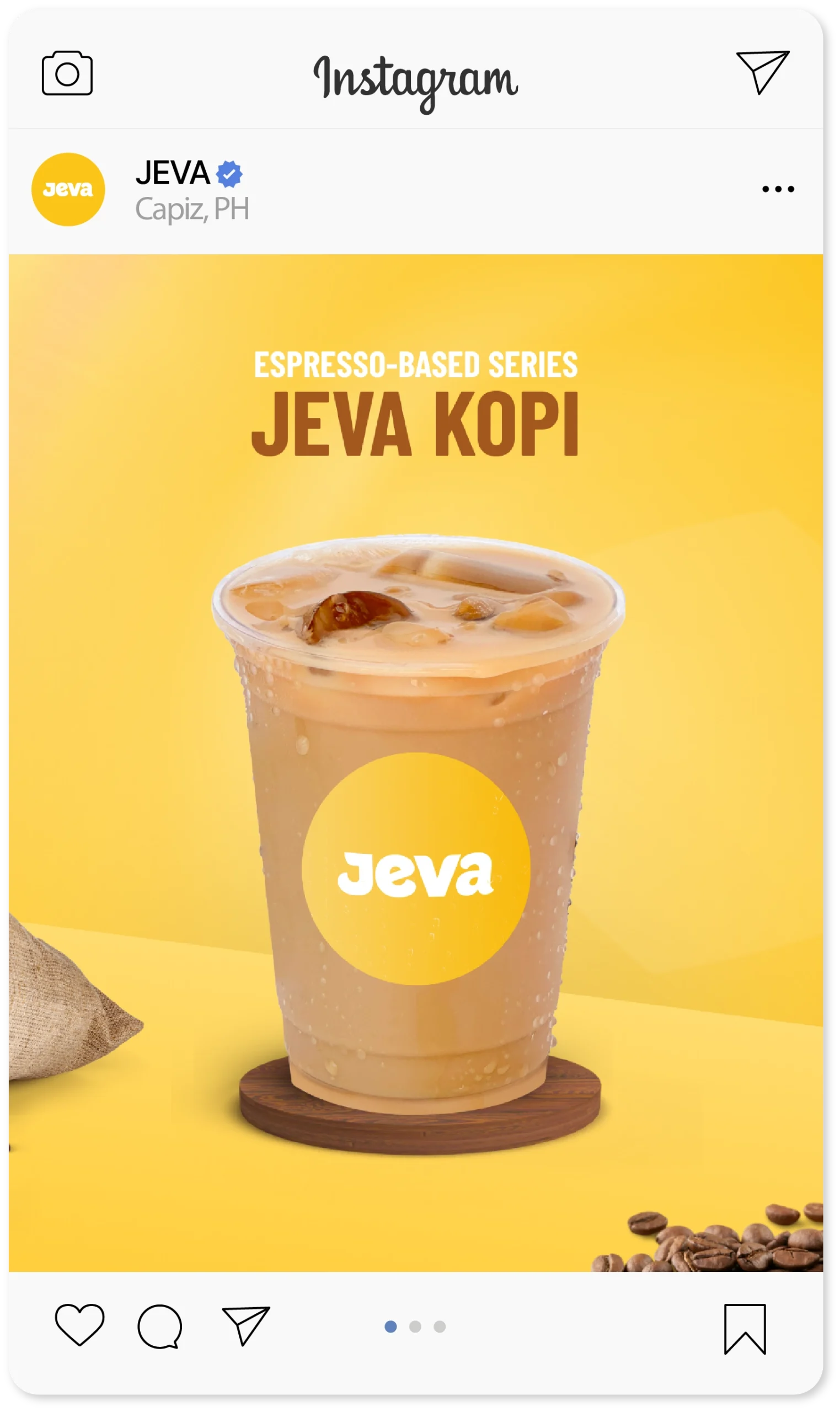
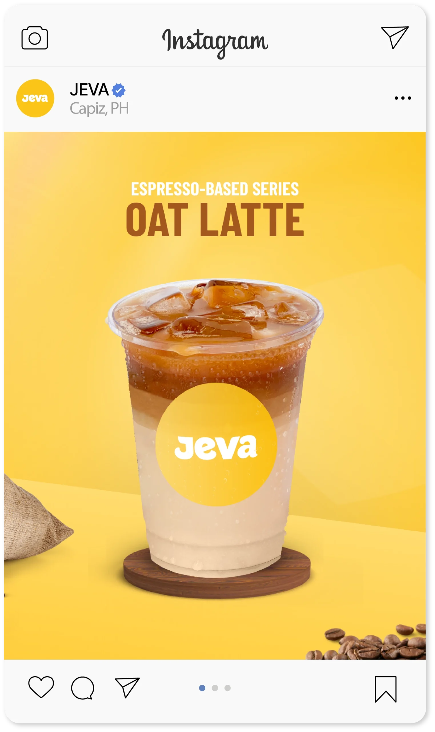
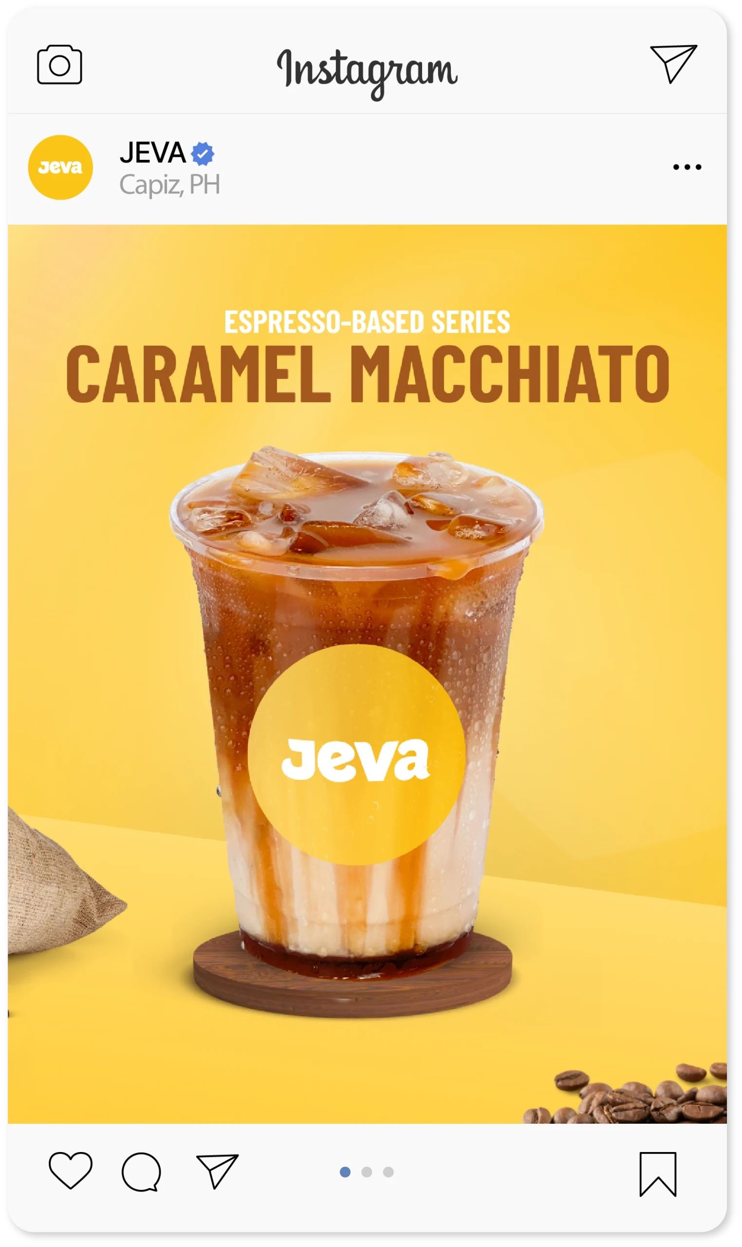
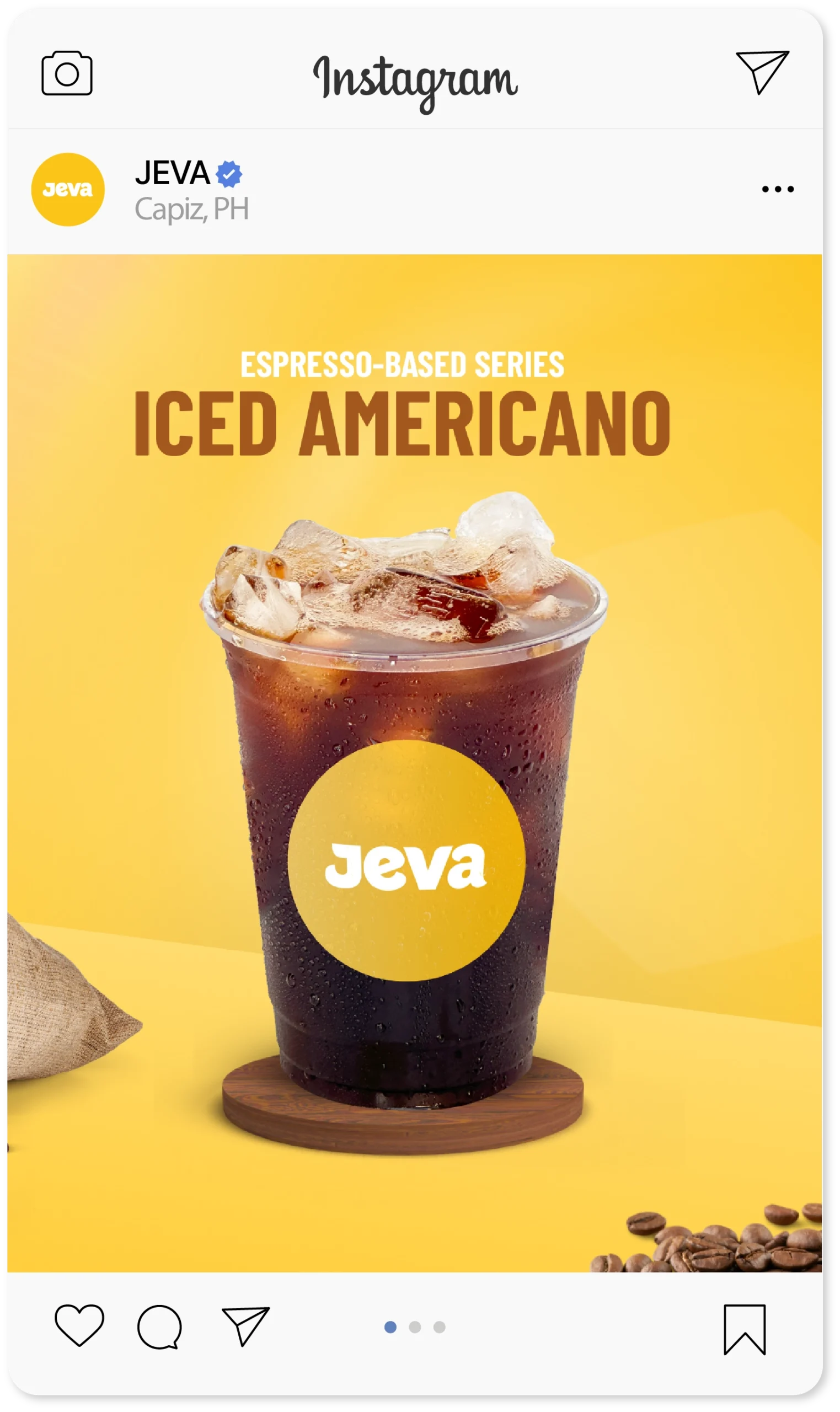
Espresso-Based Series
Now, Their Brand Works as Hard as They Do.
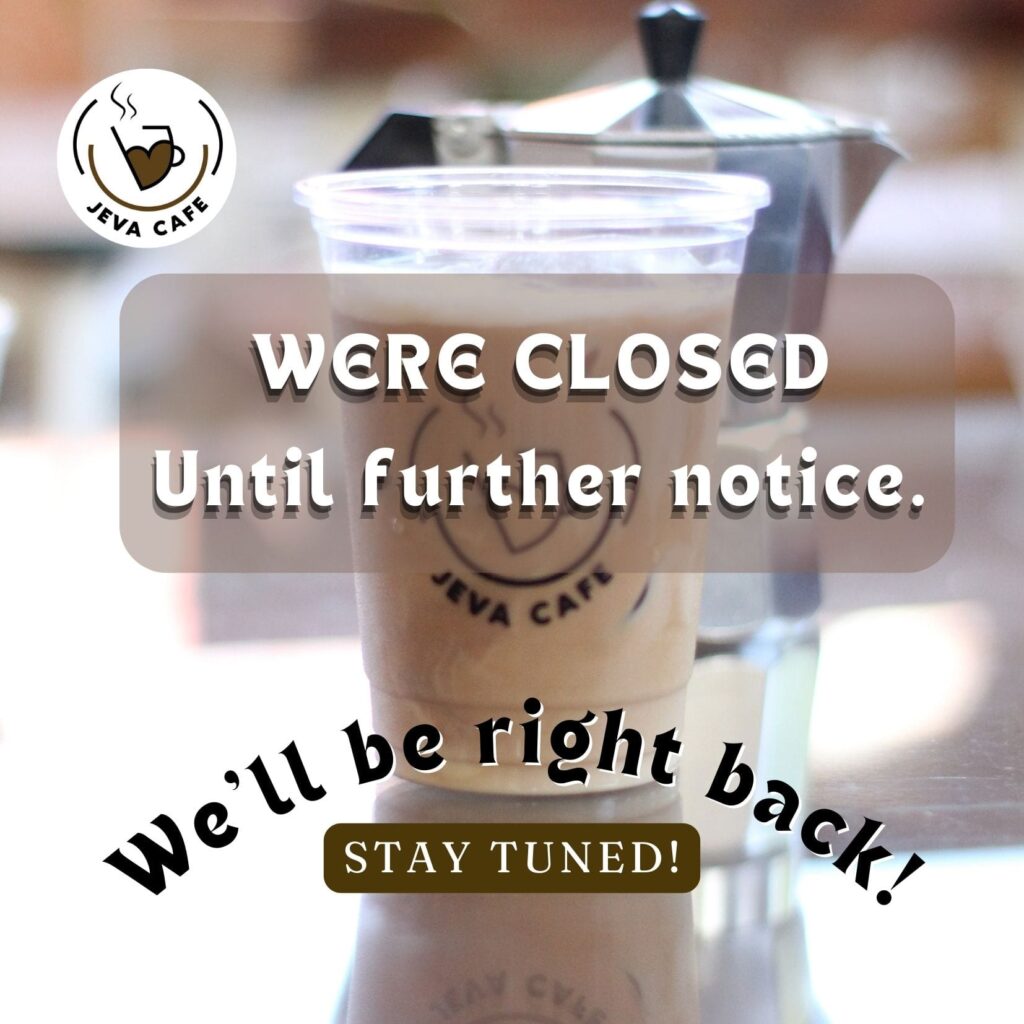
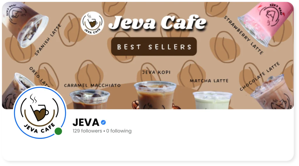
Before Rebrand
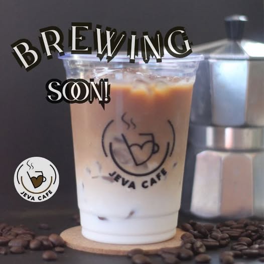
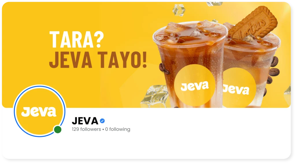
After Rebrand
We helped them apply the brand across every touchpoint:
From loyalty cards to posters, menu boards to Instagram drink series — every piece felt consistent and true to their story. We also cleaned up their Facebook presence with new headers and a refreshed tone of voice.
"They’ve played a key role in shaping JEVA into the brand it is today."
Jessiery Duron
Owner, JEVA
Looking for the perfect team to bring your next project to life?