Harvest Blend: Shaping First Impressions with Branding
The Background
Harvest Blend came to us wanting more than just nice packaging. They wanted to feel like a brand you’d trust the first time you see it. Something that feels homemade, rooted, and ready for market shelves from day one.
The Challenge
Harvest Blend was brand new but it couldn’t look new. It needed to feel like it had history: trusted, authentic, and familiar from the very first glance. At the same time, it also had to look premium and high quality. They wanted packaging that felt heritage-inspired and classic, but still clean and refined.
Scope of the Project
Brand Strategy Logo & Identity Systems Packaging Design
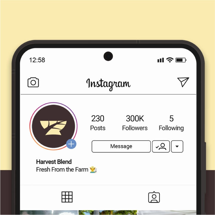
Visual Identity
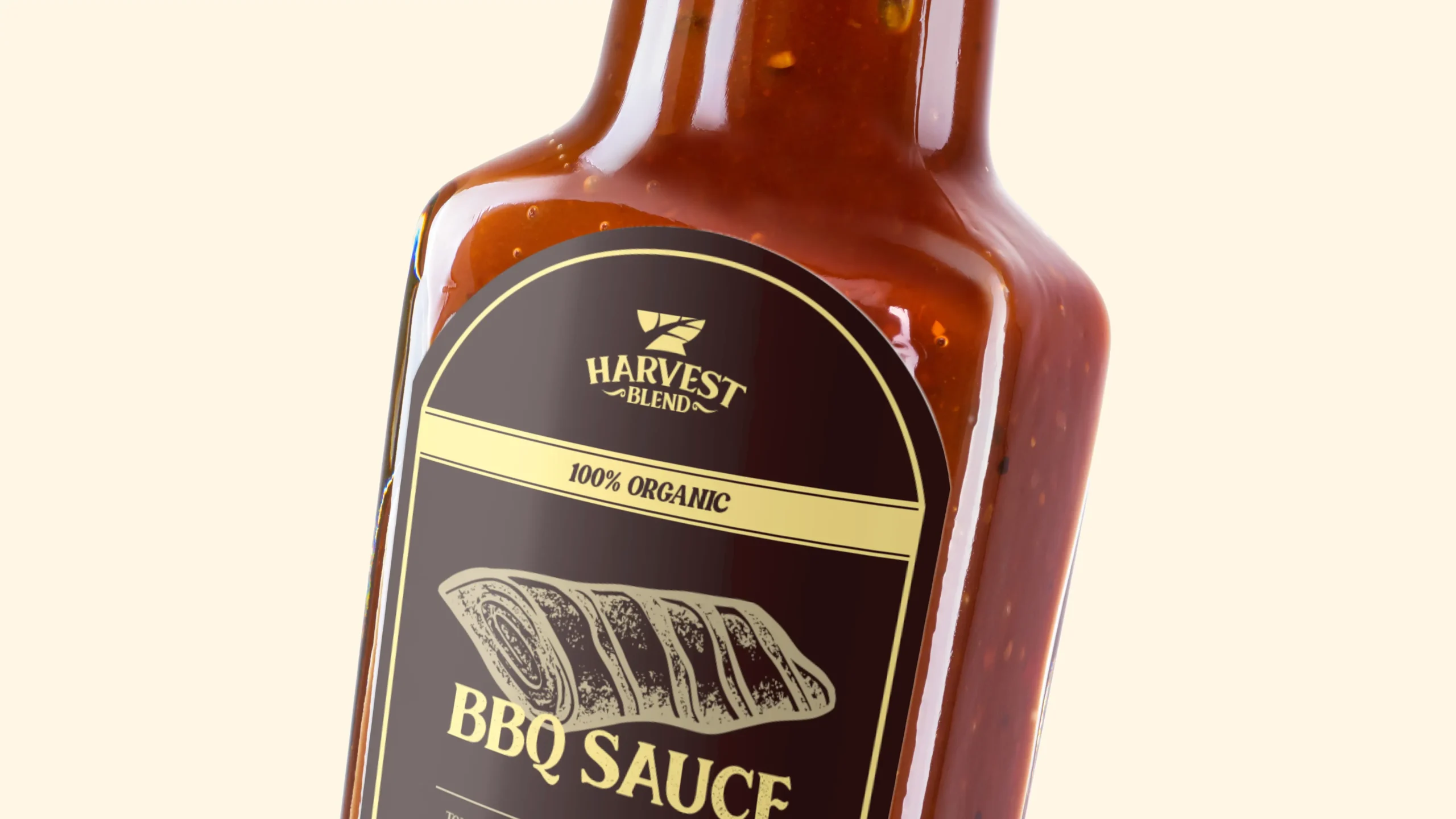
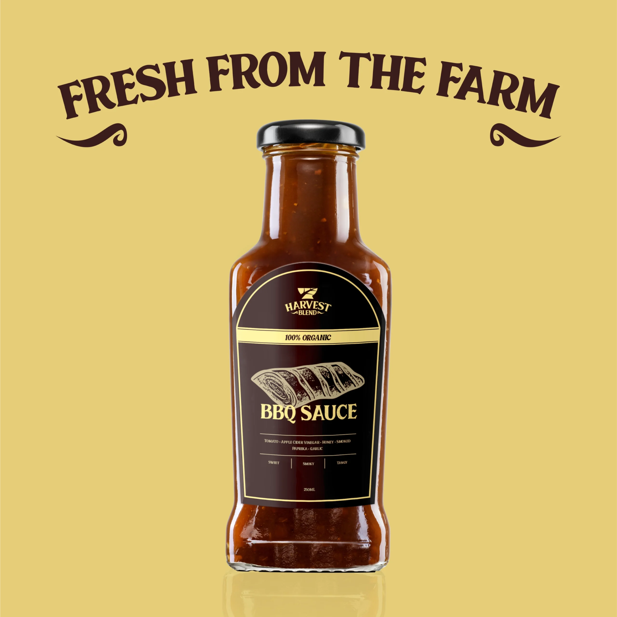
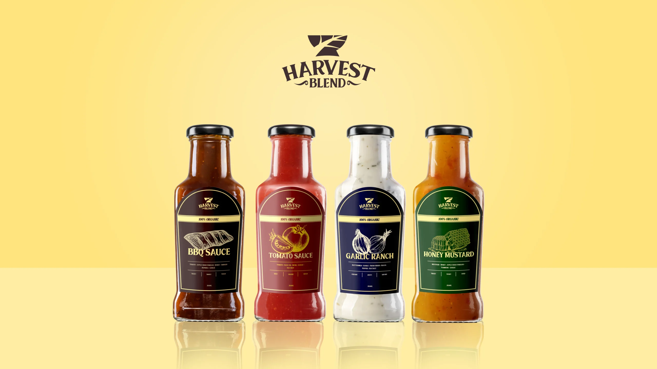
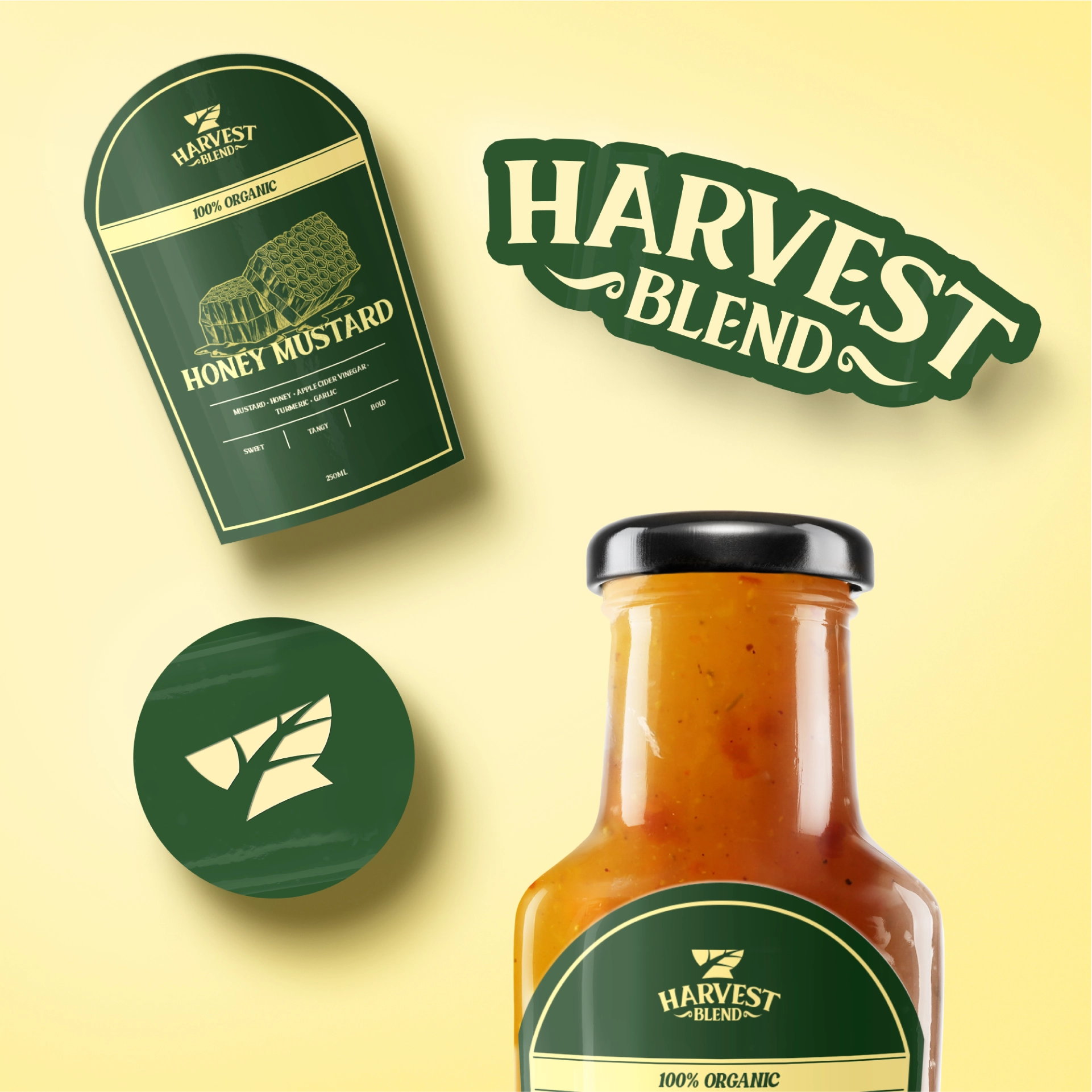
We designed a mark that feels heritage-inspired but unique enough to stand out. It combines a leaf, a mortar, and winding farm roads into a shape that’s easy to remember and strong enough to own. To make it feel premium, we chose dark, rich colors like deep green and warm gold, paired with classic serif typography that feels elegant but familiar.
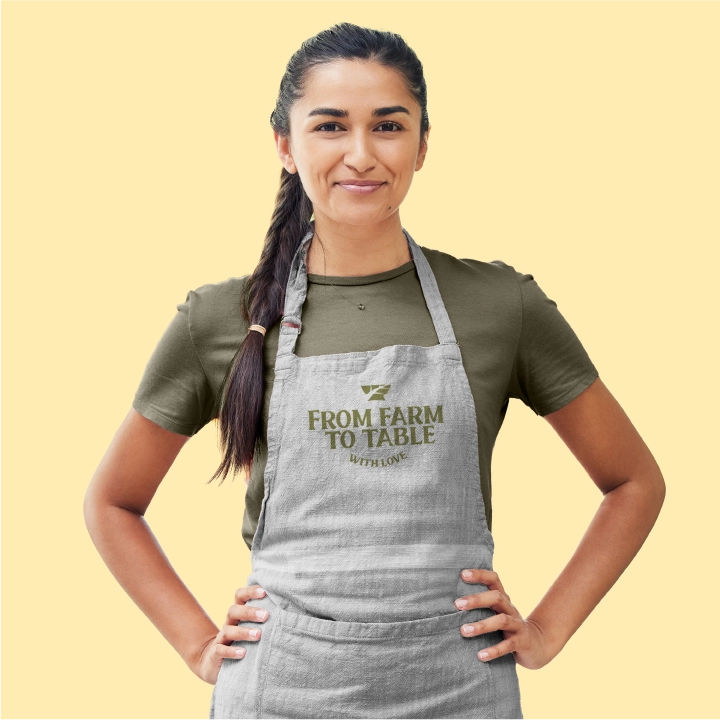
Packaging & Experience
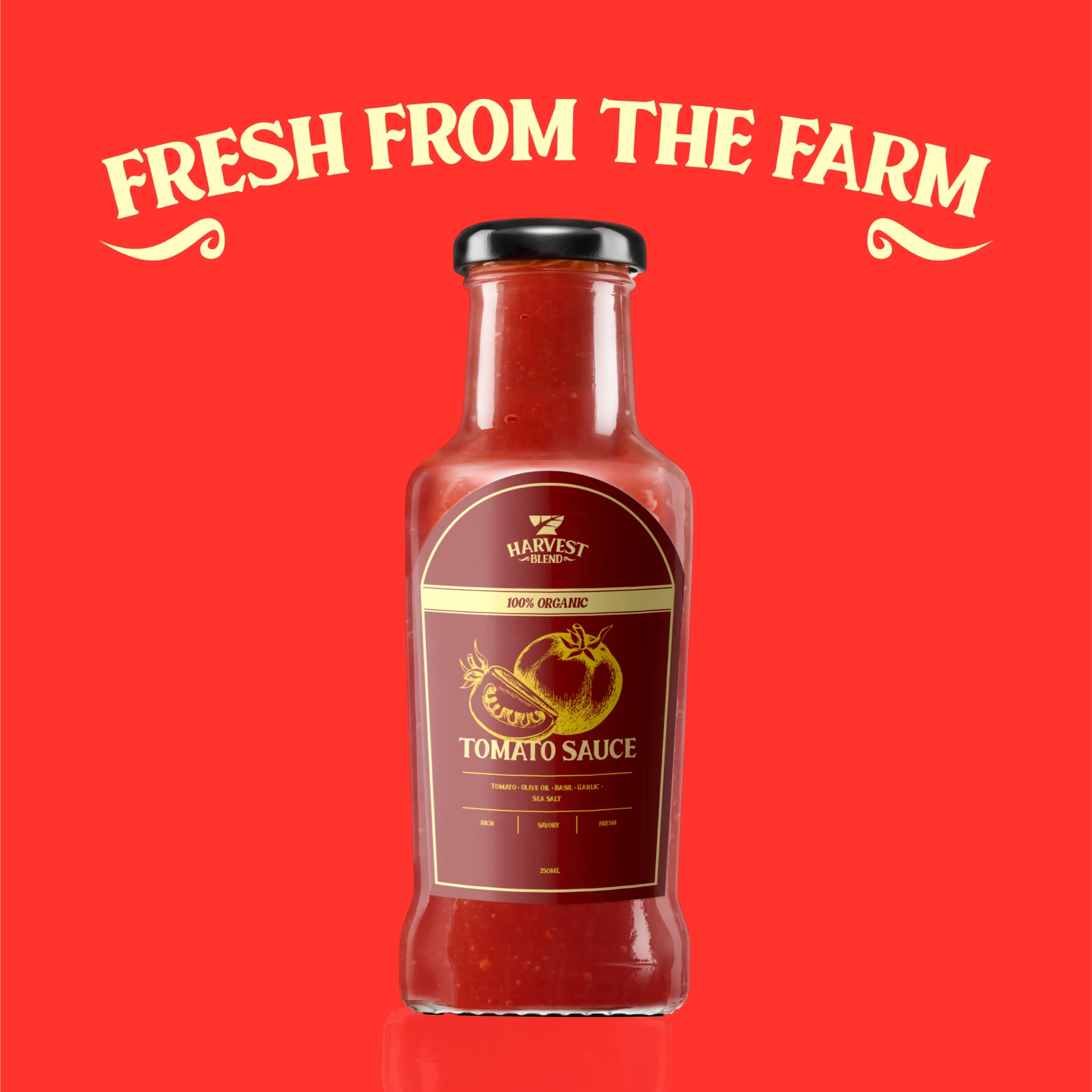
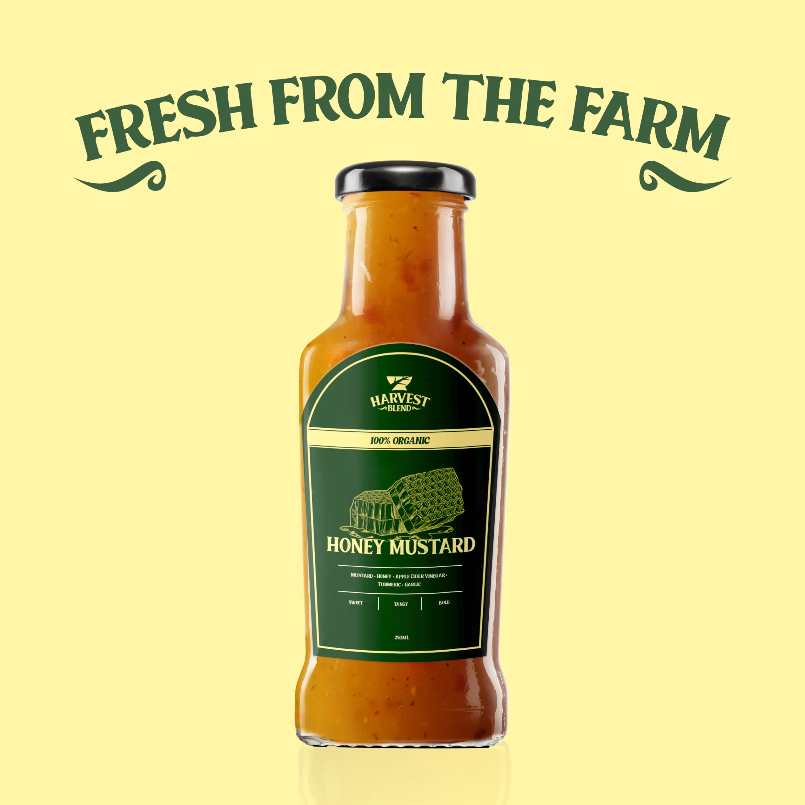
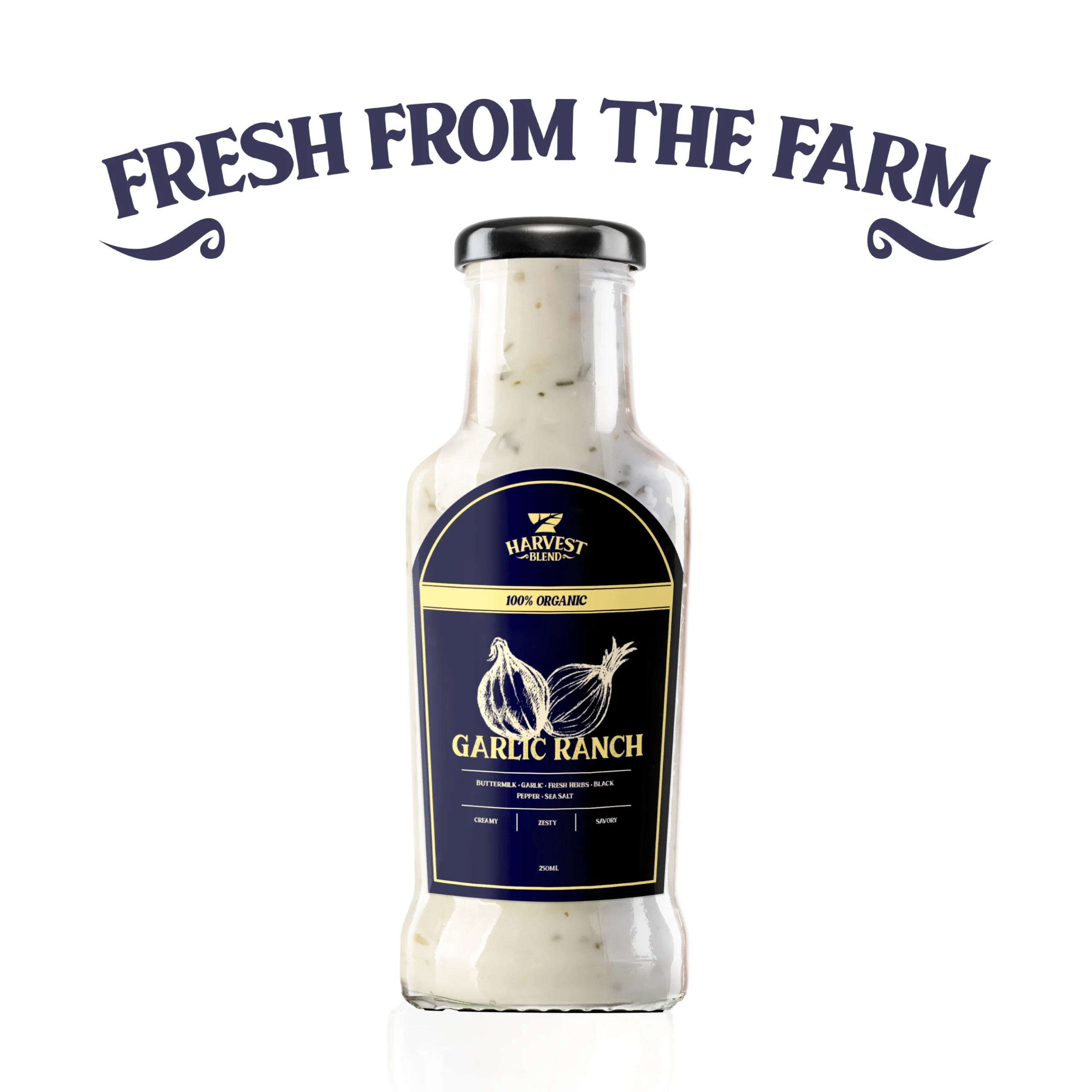
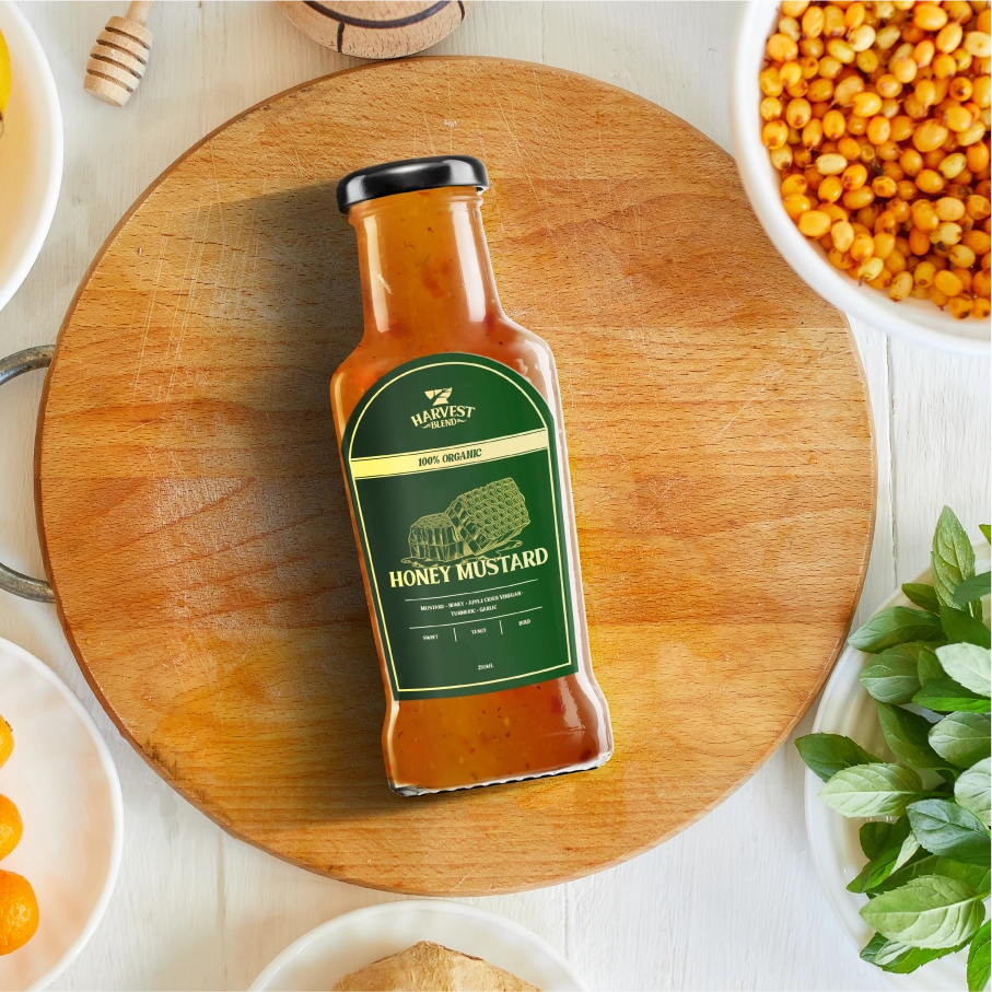
We created packaging that feels handcrafted but clean: jars that look at home at a farmer’s market or on a boutique shelf. Each flavor has its own accent color to keep things fresh yet consistent.
The Result
When it all came together, Harvest Blend felt trusted, warm, and quietly premium — like it belongs in the pantry of every home cook.
Looking for the perfect team to bring your next project to life?