Marina Elara
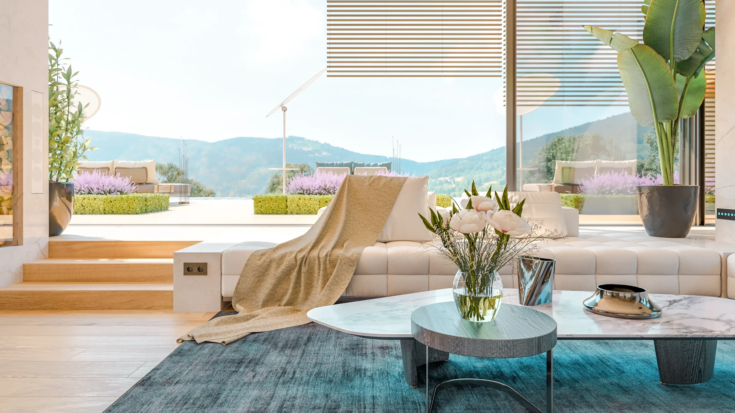
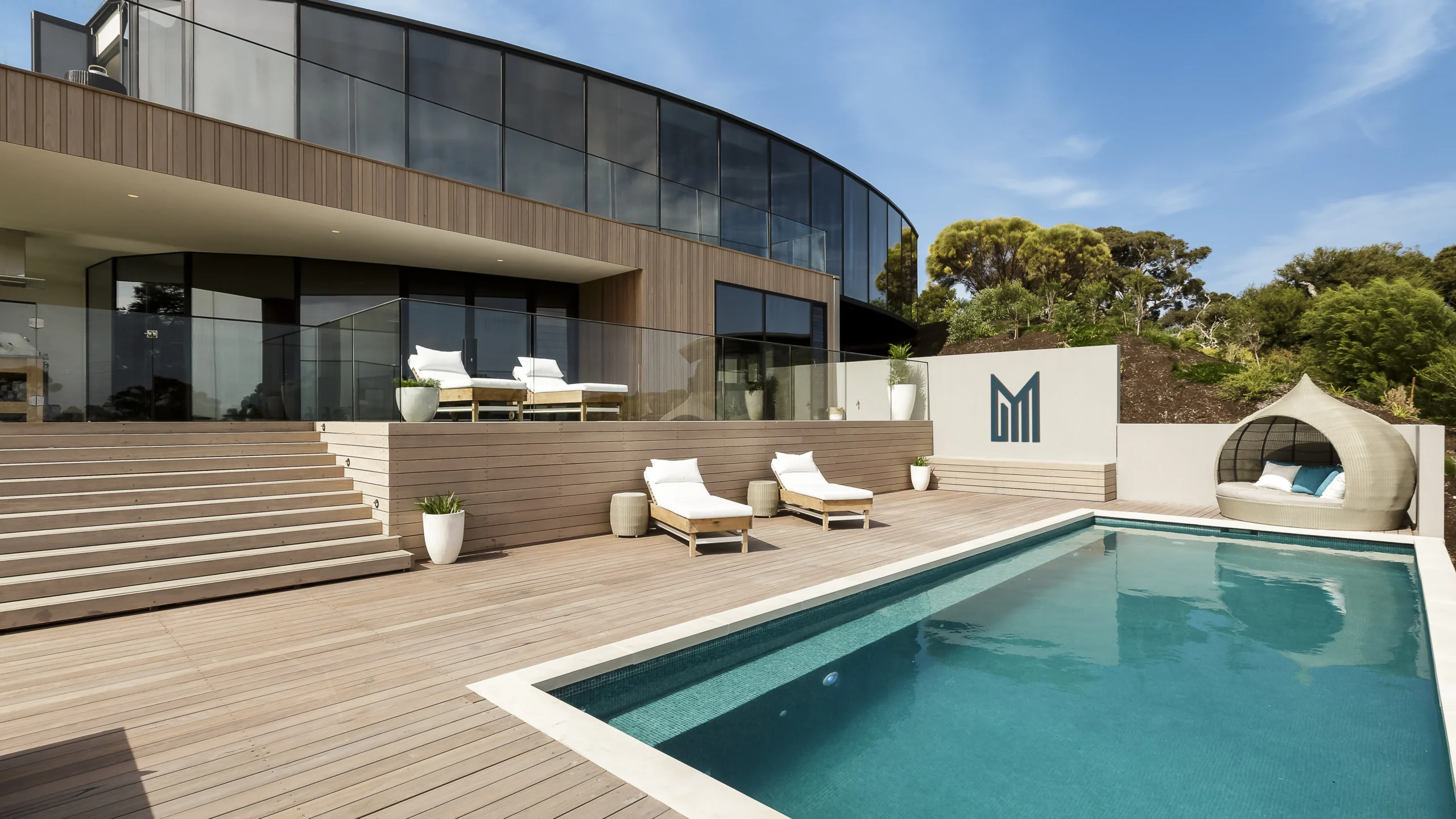
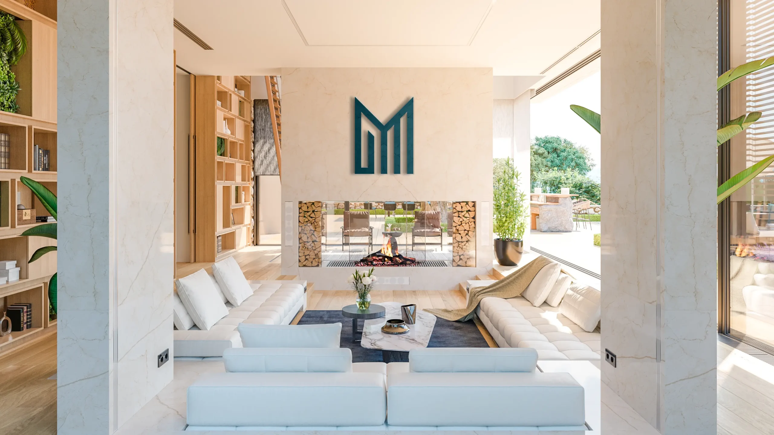
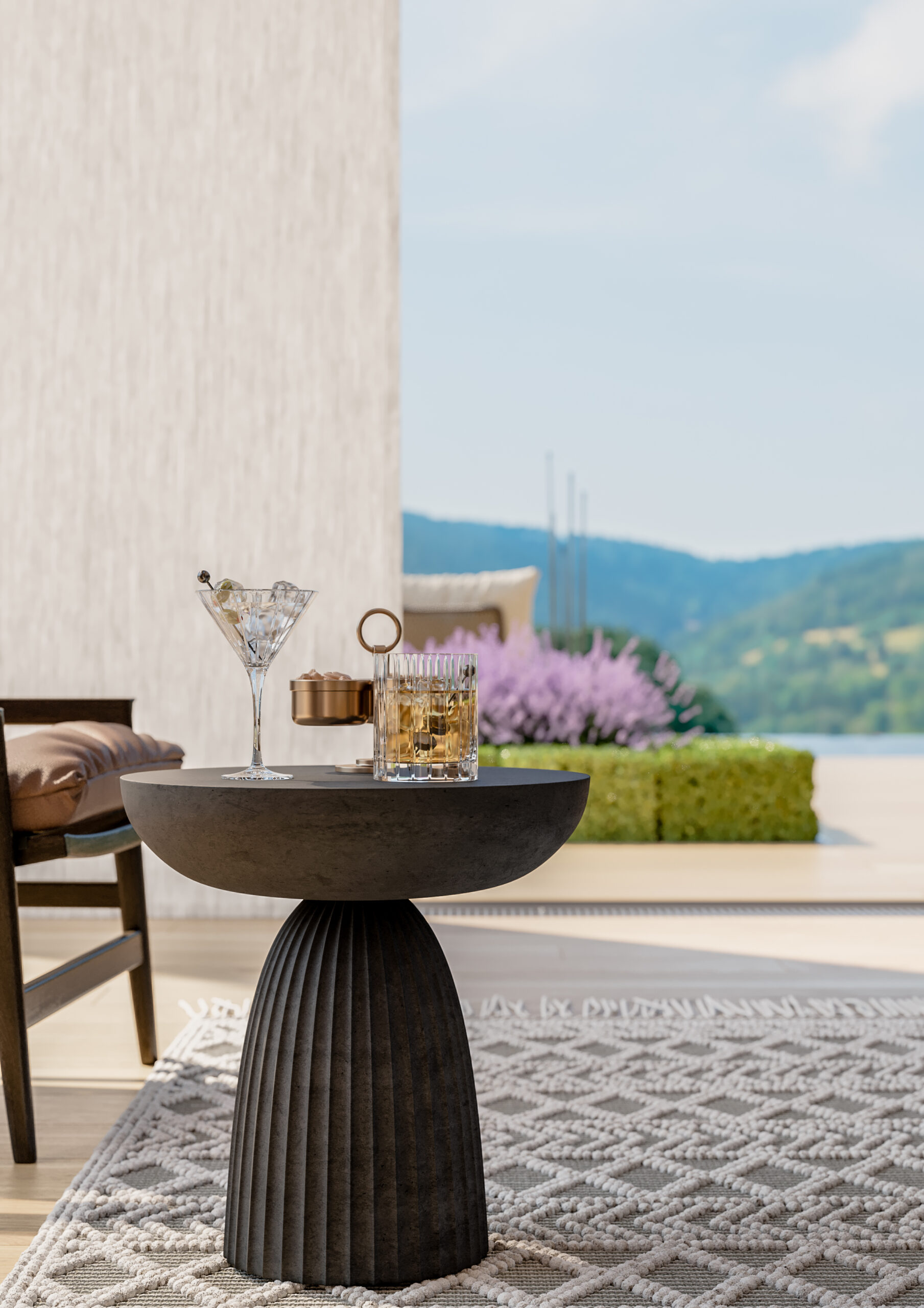
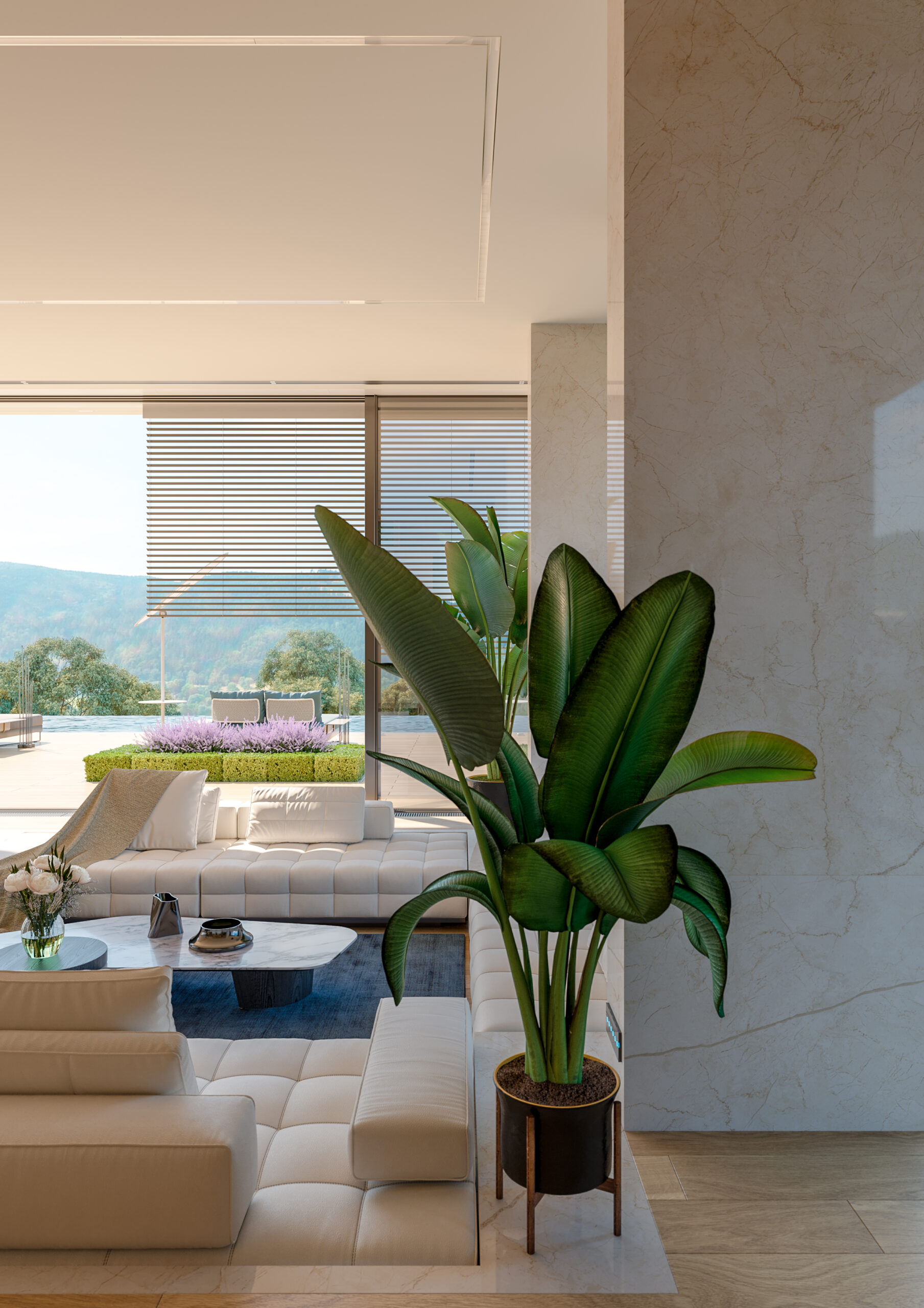
A secluded private island resort, offers an unparalleled escape into luxury and tranquility. Designed to harmonize with its natural surroundings, the resort blends modern comfort with Balinese-inspired serenity. Each villa, a private oasis, provides an immersive experience that invites guests to unwind and reconnect with nature.
Scope of the Project
Brand Strategy
Logo & Identity Systems
Industry
Hospitality & Resort
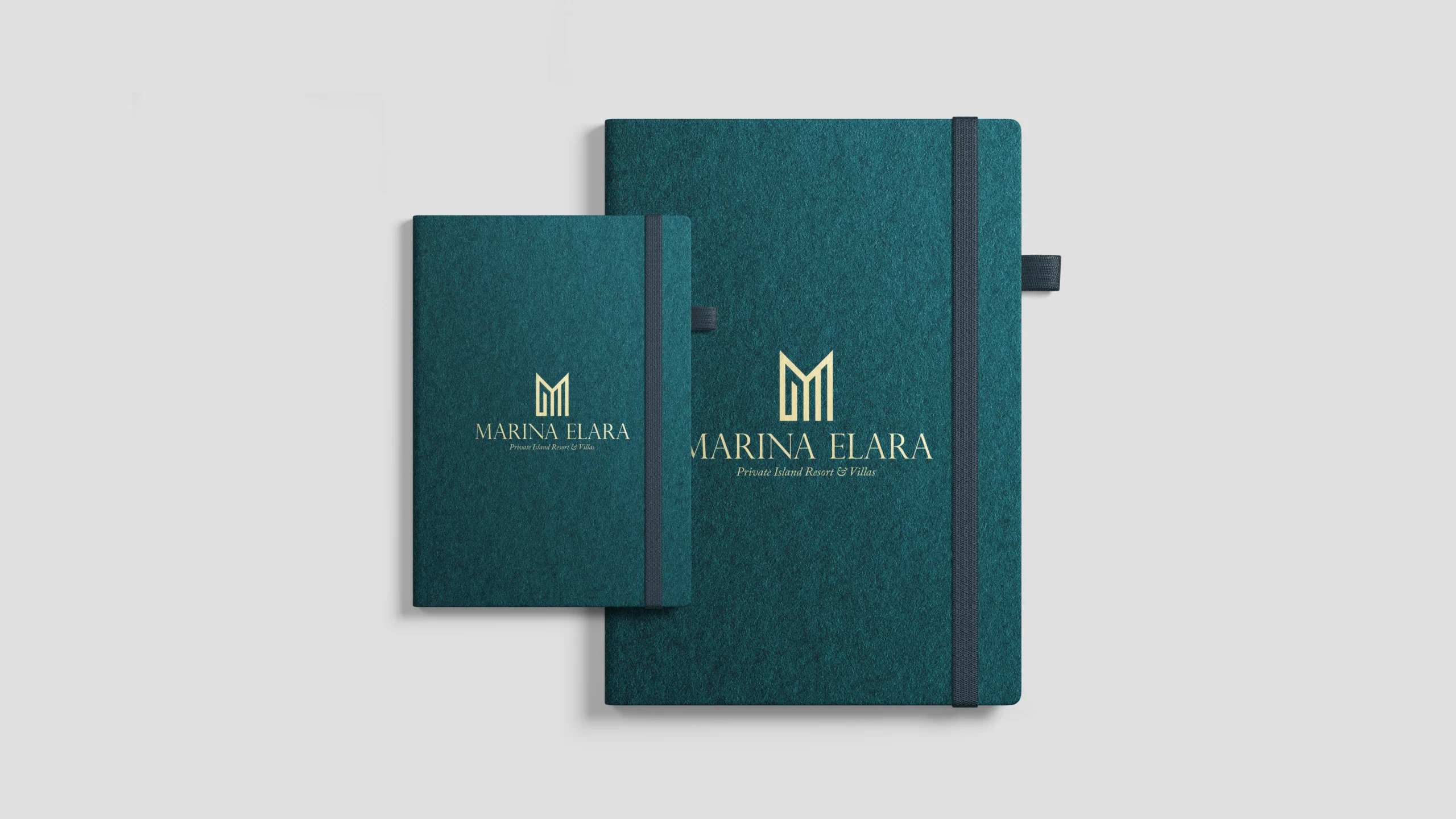
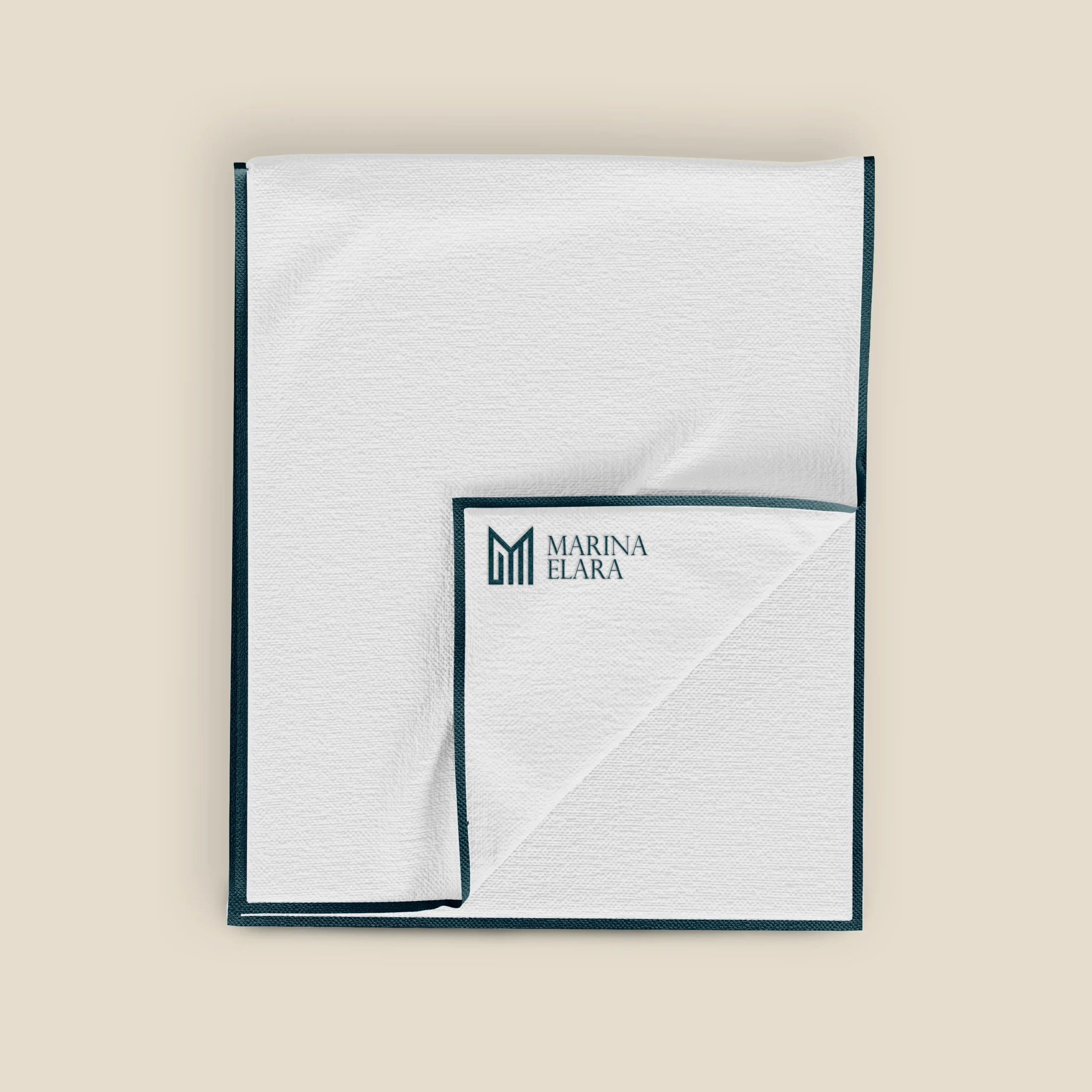
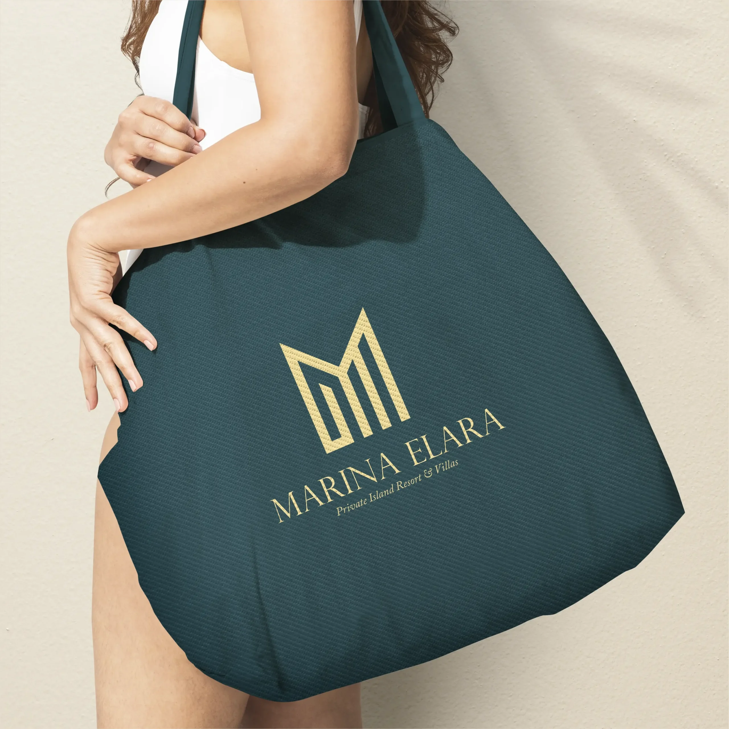
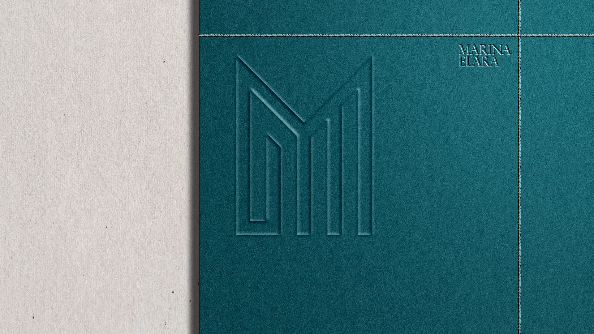
The Marina Elara logo was designed to reflect the seamless blend of modern luxury and tranquility that defines the resort. The clean, geometric lines of the M are inspired by the resort's architecture and the natural surroundings, symbolizing both strength and elegance. The interlocking shapes evoke a sense of balance and harmony, representing the connection between luxury and nature, key to the Marina Elara experience.
The Challenge
Our challenge was to capture the essence of Marina Elara’s unique environment and create a visual identity that reflected its tranquil luxury and connection to nature. The serene atmosphere, natural beauty, and attention to detail all combine to deliver an experience where every moment feels crafted for calm and rejuvenation.
The Strategy
Our approach focused on infusing the core value of tranquility into the very essence of the brand. From villa design to service interactions, every element was intended to embody elegance and serenity, mirroring the beauty of the island itself. This strategy not only emphasized the peaceful nature of Marina Elara but also allowed for flexibility in showcasing its luxurious offerings.
The color palette for Marina Elara reflects the resort’s blend of natural tranquility and luxury. Light Beige and Cream White provide a serene, neutral foundation, evoking the sandy shores and soft daylight. Sandy Beige and Light Sky Blue highlight the connection to land and sea, while Blush Beige and Muted Coral add warmth and sophistication. Midnight Teal serves as a deep, bold accent, representing the ocean’s depth, and Pale Lilac offers a soft contrast, embodying rejuvenation and calm.
For typography, we selected Caslon Pro for its timeless elegance. The Regular weight ensures readability while maintaining sophistication. Bold and Bold Italic emphasize key points with strength and exclusivity, while Italic adds a soft, refined touch, perfect for personal, luxurious moments. Together, they reflect the resort’s balance of simplicity and bespoke luxury.
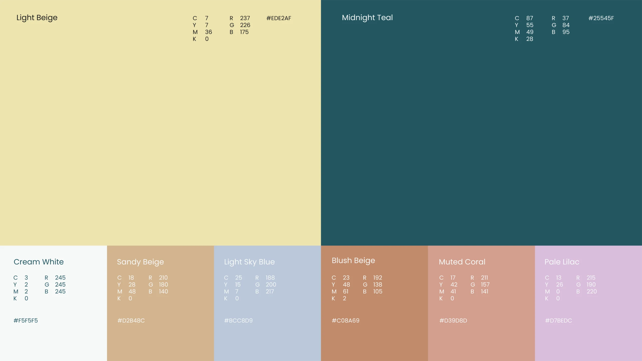
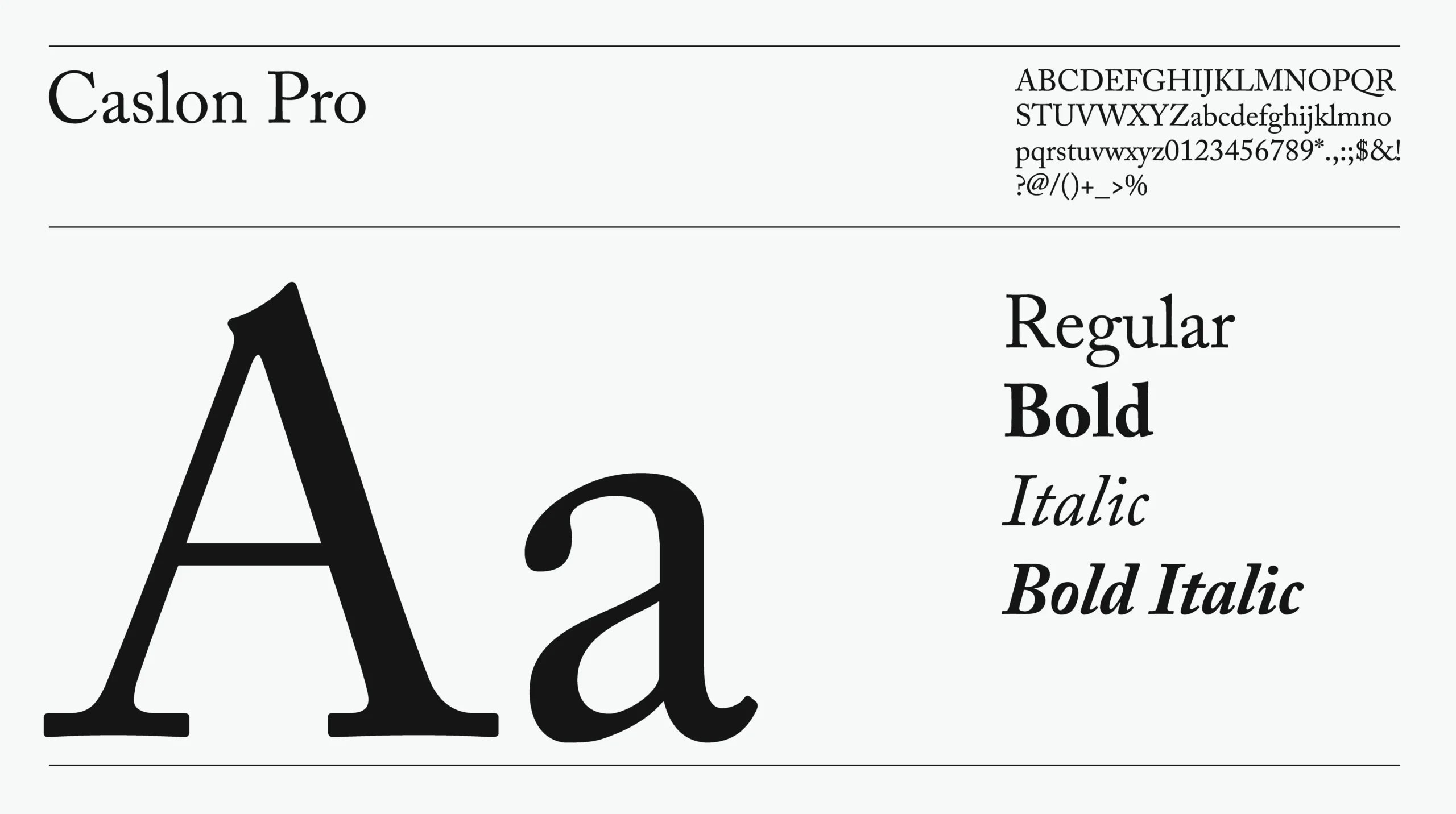
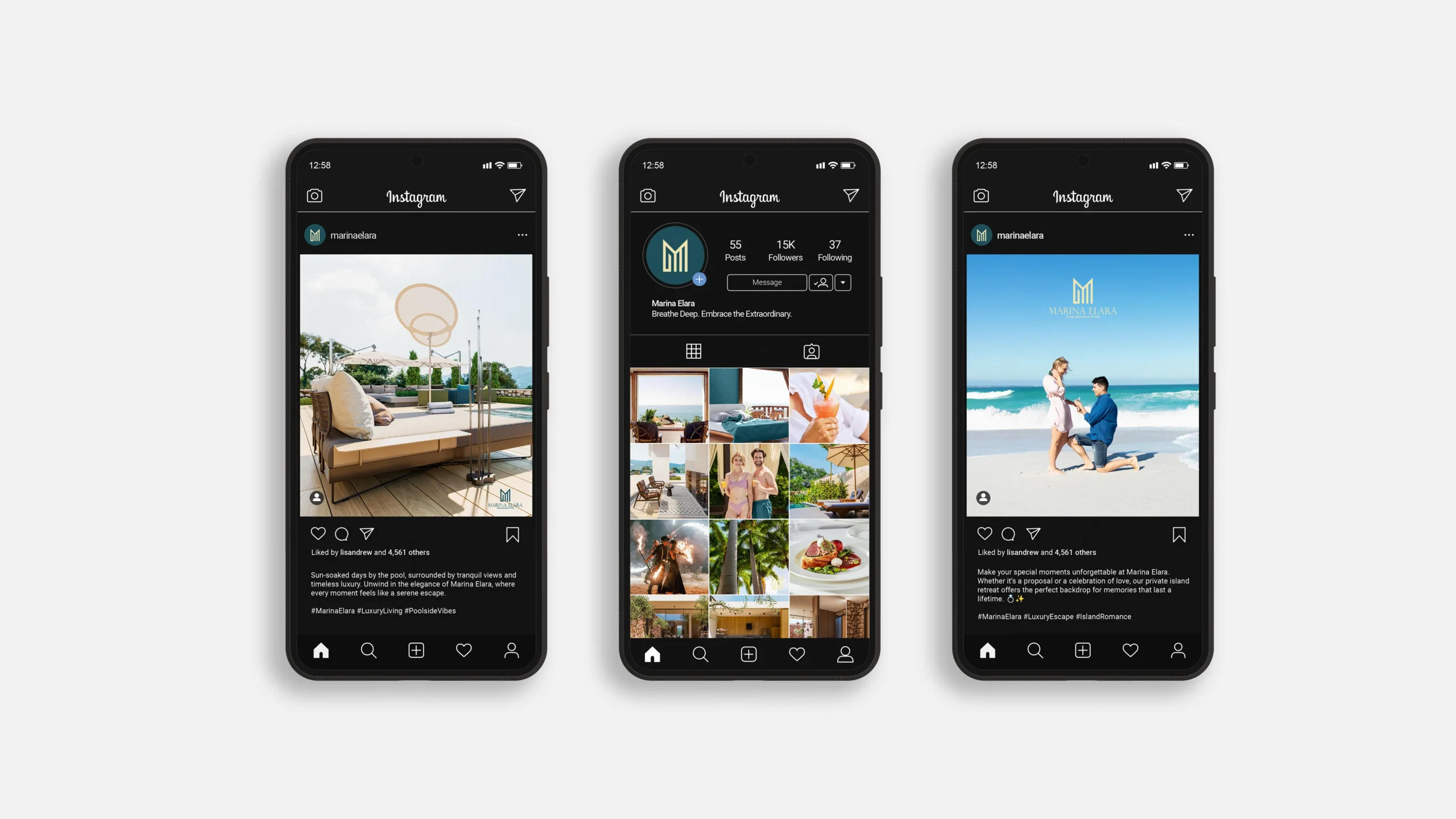
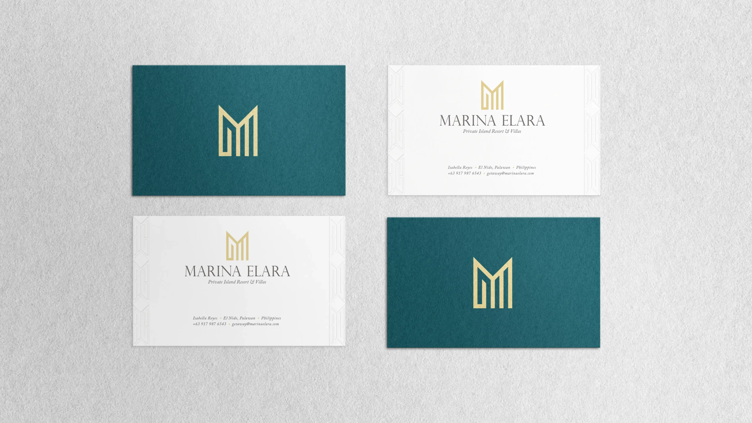
We crafted a minimal, yet bold brand identity centered on Marina Elara's exclusivity and calm. The logo design reflects this duality of elegance and simplicity. Our choice of soft, earthy tones in the branding palette highlights the resort’s connection to the natural environment, while the clean, sophisticated typography reinforces the premium, bespoke experience Marina Elara provides. The result is a refined, inviting brand that speaks directly to discerning guests seeking serenity in luxury.
